How to Format a Resume That Software and People Can Both Read
When you upload a resume to a company careers page or a portal like Naukri, software usually pulls the text out of the file before any person looks at it. This guide explains, in plain terms, what that software does, which layouts, headings and file types it handles well, how to use the words from the job description without stuffing, and how to test your own file in two minutes. It also covers the limits of this site's own builder, because its PDF download is not the right file for every portal.
What happens to your file after you click Upload
Most large employers and job portals use hiring software to receive applications. When your file arrives, the software tries to read the text in it and split that text into fields: name, phone, email, job titles, companies, dates, education, skills. That is why many portals show you a pre-filled form a few seconds after an upload.
Recruiters then search and filter those fields, much as you search an inbox. A recruiter hiring an accountant might search for "GST" and "Tally" and see only the profiles where those words were found. If the software could not read your file, or read it in the wrong order, your profile can be missing from that search even though the information is on the page.
Two points are often exaggerated online. First, the software rarely "rejects" a resume on its own; more often it files it badly, so the right search does not find it. Second, not every application goes through it: a resume emailed to a hiring manager, or handed over at a campus placement drive, is read by a person. Formatting for software is about not being invisible, not about gaming a score.
Layout choices: what parses cleanly and what gets scrambled
A layout that a person finds easy to scan is not always one that software reads in the right order. The usual problems are predictable:
| Design choice | What can go wrong | Safer option |
|---|---|---|
| Two columns or a sidebar | Text may be read across both columns line by line, mixing skills into job entries | One column; or keep the sidebar to contact details and skills only |
| Tables used for layout | Cells may be read in an odd order or skipped | Plain paragraphs and bullet lists |
| Text boxes and shapes | Some software ignores text inside them | Type the text directly on the page |
| Contact details in the page header | Some software does not read the header area at all | Put name, phone and email in the body at the top |
| Icons instead of words (a phone symbol, an envelope) | The icon is an image; the label disappears | Write "Phone:" and "Email:" or just the details themselves |
| Skill bars, stars, rating dots | The level is a graphic; only the skill name (if any) survives | List skills as words, with evidence where possible |
| Unusual or decorative fonts | Characters may come out garbled | Common fonts such as Arial, Calibri, Georgia |
None of this makes two-column designs wrong. A sidebar resume can be a good choice when you are emailing it to a person or handing it over at an interview. The question is only where the file is going. For a portal upload, a single column is the lower-risk choice.
Section headings and dates: use the labels software expects
Hiring software decides which section a line belongs to largely from the heading above it. Standard headings make that easy; creative ones make it guess. The same goes for a human reader skimming for your last job.
Renaming creative headings
Where I've Made an Impact / My Toolkit / The Learning Years / Let's Talk
Work Experience / Skills / Education / Contact
Other headings that are widely recognised: Summary, Professional Experience, Projects, Certifications, Internships, Achievements, Languages.
Dates matter because software uses them to calculate how many years of experience you have. Write each role's dates the same way, with month and year: "Jun 2022 – Mar 2025" or "06/2022 – 03/2025", not a mix. Put the job title, company and dates on the same line or on consecutive lines so they are read as one entry.
- Spell out an abbreviation the first time if the job description does: "Chartered Accountant (CA)", "Search Engine Optimisation (SEO)". People search for either form.
- Write your degree the way it is commonly written: "B.Tech, Computer Science" rather than an internal college code.
- For freshers, CGPA or percentage can sit on the degree line ("CGPA 8.1/10"); 10th and 12th marks usually only need to appear if the employer asks for them.
File type: PDF or Word, and why "text-based" matters more
If the posting names a format, use it. If it does not, a PDF is usually fine because it looks the same on every device, and a Word file (.docx) is also widely accepted. The more important question is whether your file contains real text.
A PDF can be made in two ways. A text-based PDF, such as one saved from Word or Google Docs, stores the actual characters, so you can highlight and copy them. An image-based PDF, such as a scan or a picture of a page, stores only how the page looks. People can read it perfectly; software that extracts text cannot, unless it runs character recognition, which many portals do not do reliably.
Also name the file sensibly ("Anjali-Rao-Accountant-Resume.pdf") and keep it small. Some portals reject uploads above a size limit, and a resume full of high-resolution images is the usual culprit.
Using words from the job description honestly
Because recruiters search by terms, your resume should use the same words the employer uses for skills you genuinely have. If the posting says "accounts payable" and you wrote "vendor payments", both are true, but only one will match a search. This is wording, not exaggeration.
- Copy the job description into a document and highlight the hard requirements: tools, qualifications, methods, domain terms ("Power BI", "B2B sales", "IFRS", "React").
- Mark each one you can honestly back up with something you did.
- Check that each marked term appears in your resume in the employer's wording, ideally inside a bullet that shows you using it, not only in the skills list.
- Ignore terms you cannot back up. If an interviewer asks about it, you will have to explain why it was there.
Matching a posting that asks for "stakeholder management" and "Jira"
Coordinated with different teams to complete projects on time.
Ran weekly status calls with product, design and client stakeholders; tracked 120+ tickets a sprint in Jira and cut overdue items from 30 to 8 over two quarters.
Both terms now appear naturally, with evidence. Numbers here are illustrative; use your own.
Two tricks circulate online and are worth avoiding. Pasting the whole job description into the resume in white or tiny text shows up the moment a recruiter views the parsed text or selects the page, and it reads as dishonest. Repeating a keyword ten times does not help either: a person still has to read the result. For a step-by-step method of adjusting each application, see how to tailor your resume for each job.
The two-minute self-test: see what the software sees
You do not need a paid scanner to check your file. A plain text editor shows you roughly what extraction software gets.
- Open the exact file you plan to upload (not the document you edited it from).
- Press Ctrl+A, then Ctrl+C. If nothing highlights, the file is image-based and will not be read.
- Paste into Notepad (Windows) or TextEdit in plain-text mode (Mac).
- Read the result top to bottom. Is your name first? Are your phone and email there? Does each job read as title, company, dates, then its bullets?
- Look for warning signs: bullets from one job appearing under another, skills interrupting your work history, missing contact details, odd symbols where icons were.
- Fix the layout causing the problem, export again and repeat.
A second check, if the portal offers it: after uploading, look at the pre-filled form before you submit. Wrong job titles or empty fields tell you exactly what the software misread, and you can correct them in the form.
Keeping it readable for the person who reads it next
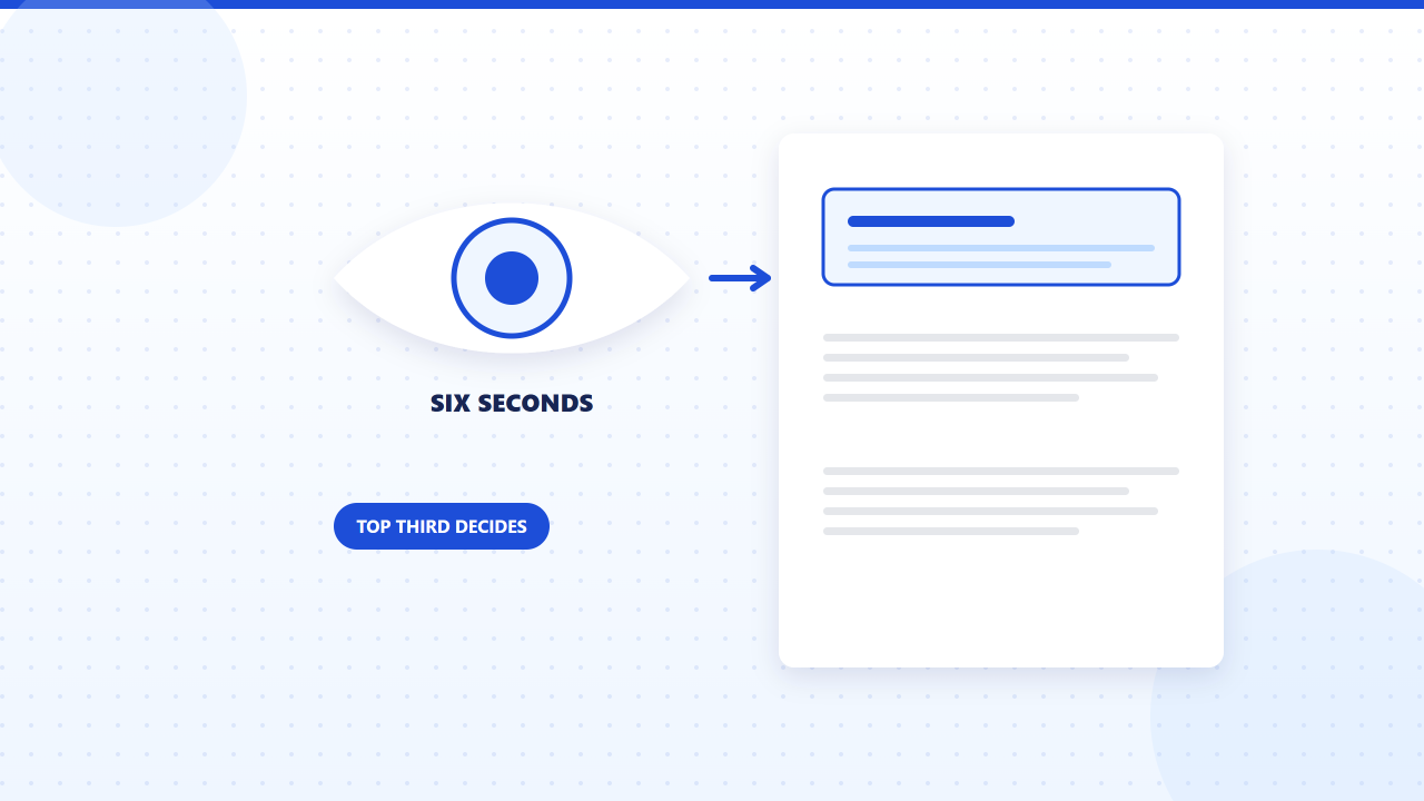
Everything above also helps the human reader, who will usually skim before deciding to read properly. A few habits make that skim work:
- Put the most relevant information in the top third of page one: a short summary and your current or most recent role.
- Keep bullets to one or two lines, starting with what you did; see how to quantify achievements for making them concrete.
- Use body text of 10–12 points and leave enough margin and spacing that sections are visibly separate.
- Use bold sparingly, for job titles or headings, so it still means something.
- Use one date format, one bullet style and one font throughout.
If you are using our builder, the two free templates, Clean Professional and Modern Bordered, are single-column with standard headings, which makes them easy for a person to scan and a sensible model for laying out your text-based copy. Several paid templates use sidebars or rating bars, which are better suited to resumes you send directly to a person.
Key takeaways
- Job portals extract the text from your file and sort it into fields; recruiters then search those fields.
- For portal uploads, use one column, standard headings, words instead of icons, and contact details in the body.
- A PDF must be text-based to be read: if you cannot copy a line from it, the software cannot either.
- Use the employer's wording for skills you really have; never paste hidden keywords.
- Test with Ctrl+A, copy, paste into Notepad, and check the portal's pre-filled form after uploading.
Put this into practice
- See every layout, including which ones use sidebars or rating bars, on the resume templates page.
- Writing the skills list itself? Read how to write a resume skills section.
- Check what each plan includes before you download on the pricing page.
Frequently asked questions
Some hiring software shows recruiters a match rating, and some does not; it varies by product and by how the employer sets it up, and you cannot see it. Websites that give your resume a percentage are estimating with their own rules. Focus on what you control: readable text, standard headings and honest use of the posting's terms.
Many people find it practical: a designed version for email and interviews, and a plain, single-column text-based version for portals. Keep the wording identical so there are no contradictions, and update both together when something changes.
Yes, because a person reads it after the software, and on Naukri or LinkedIn the recruiter often opens the original file. Clear structure, white space and consistent formatting help that reader. Heavy decoration is what causes problems, not good design.
If the portal allows it, filling the fields carefully is a reliable way to make sure your details are recorded correctly, and it is a good option if your only resume file is image-based. Most portals still ask for a file as well, which the recruiter may open later.