Resume Templates
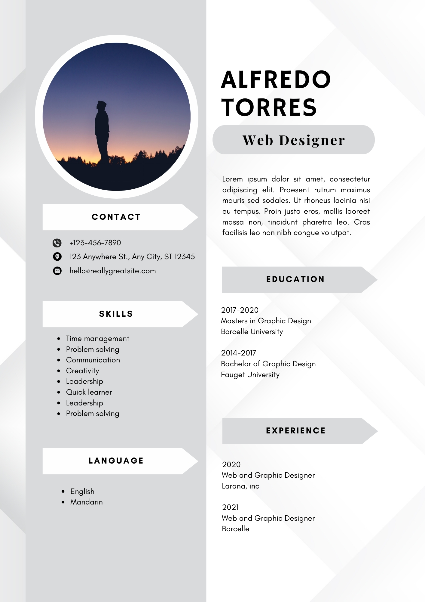
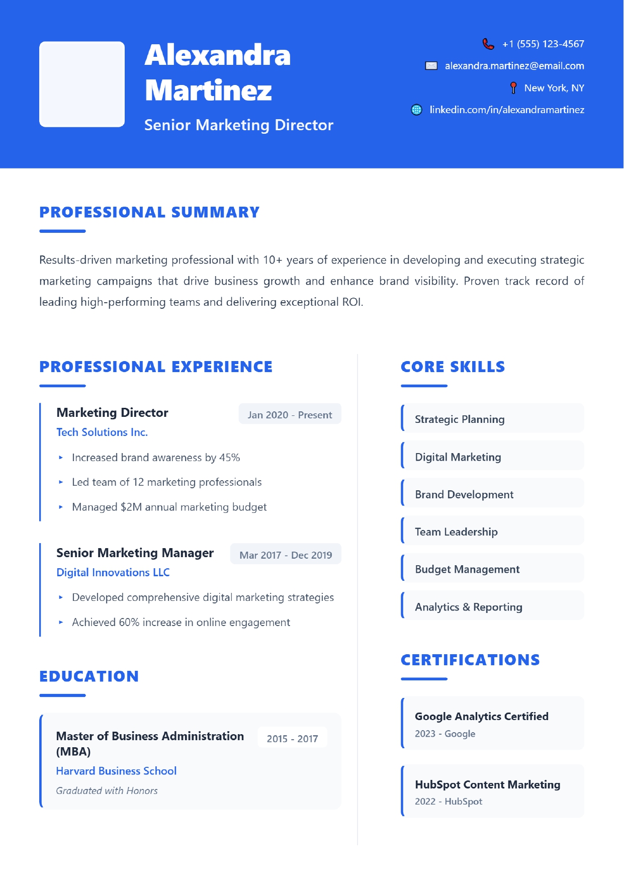
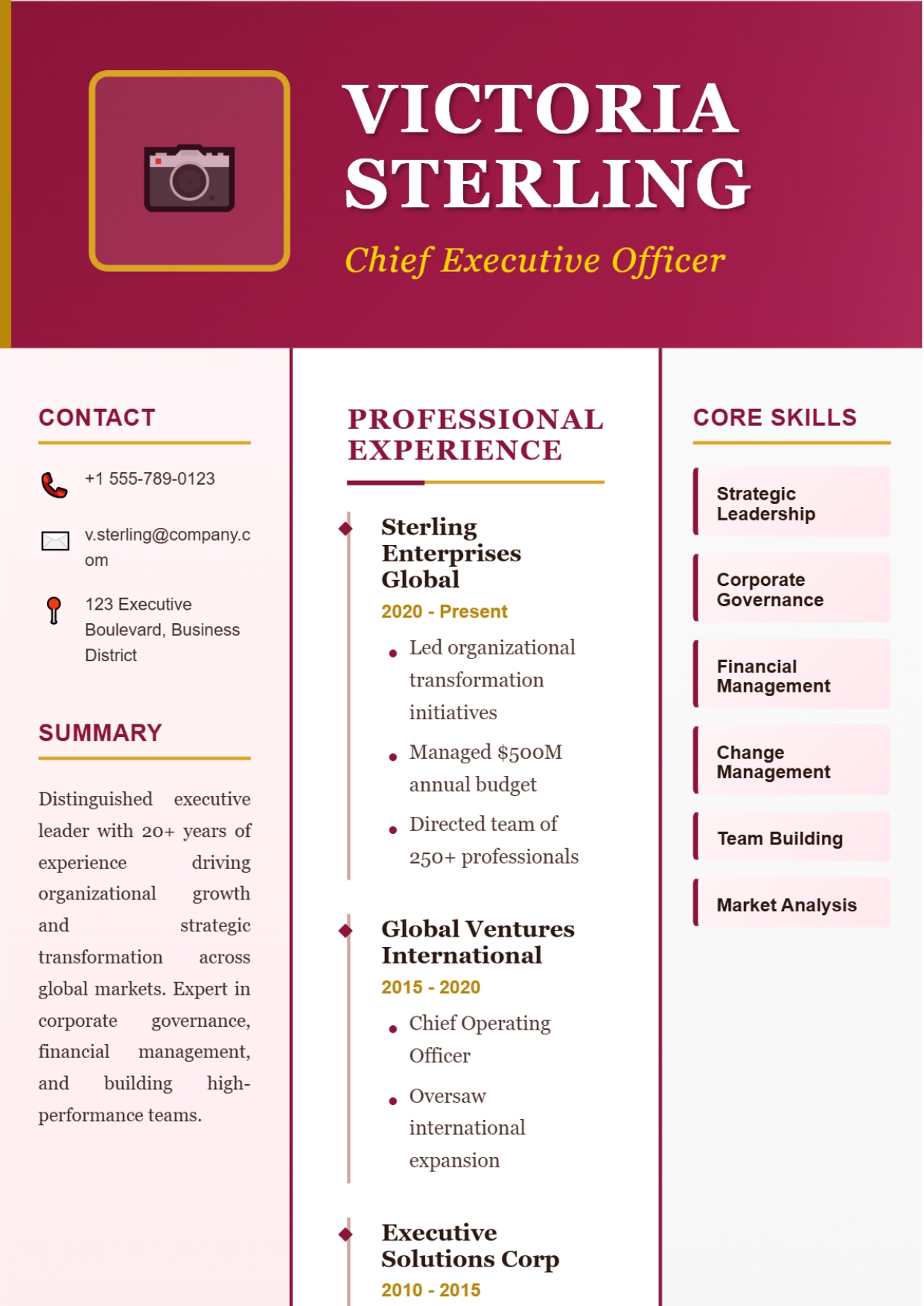
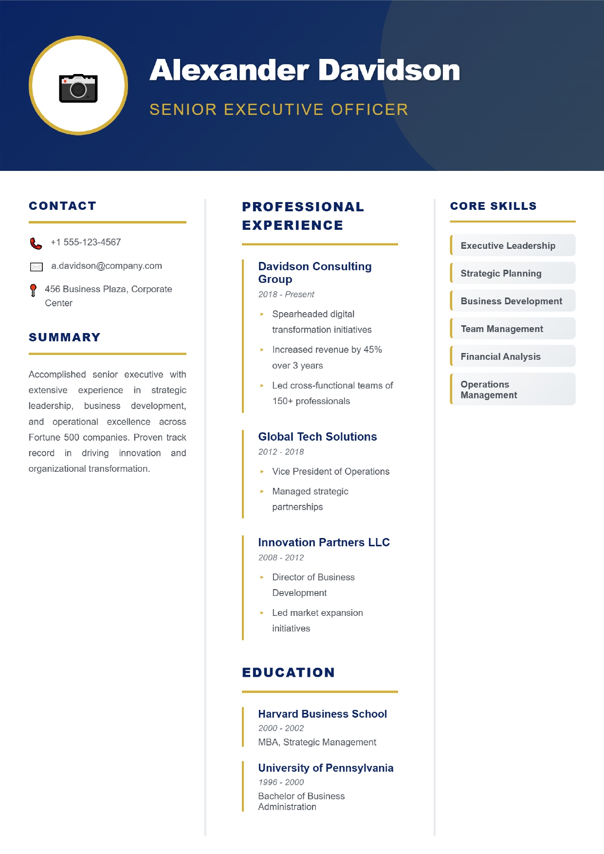
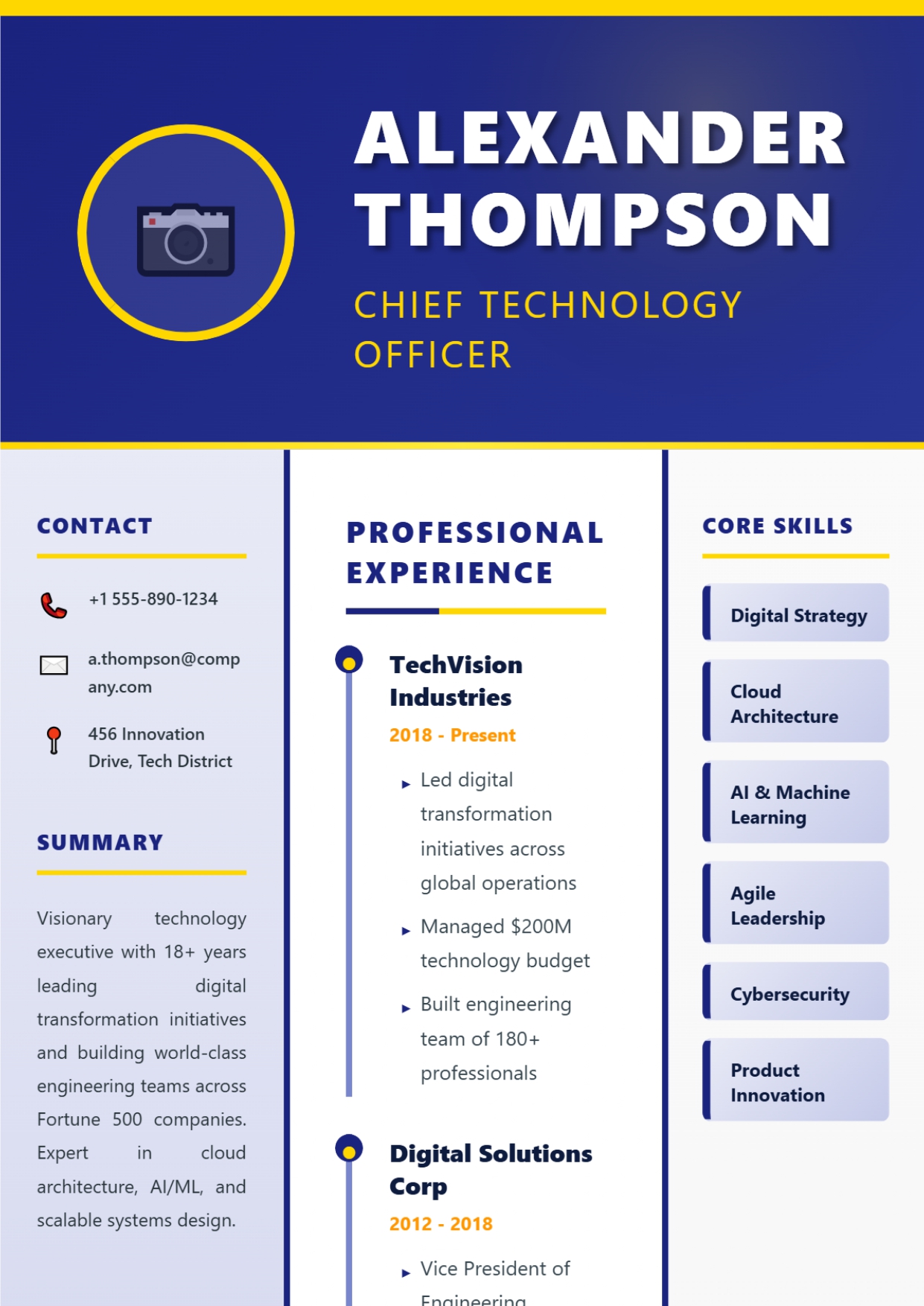
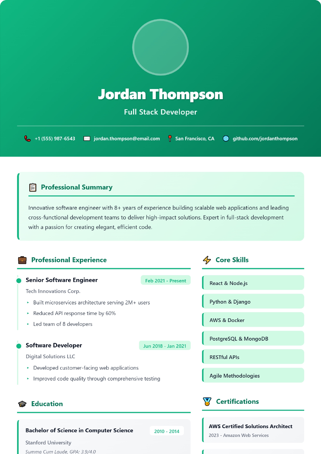
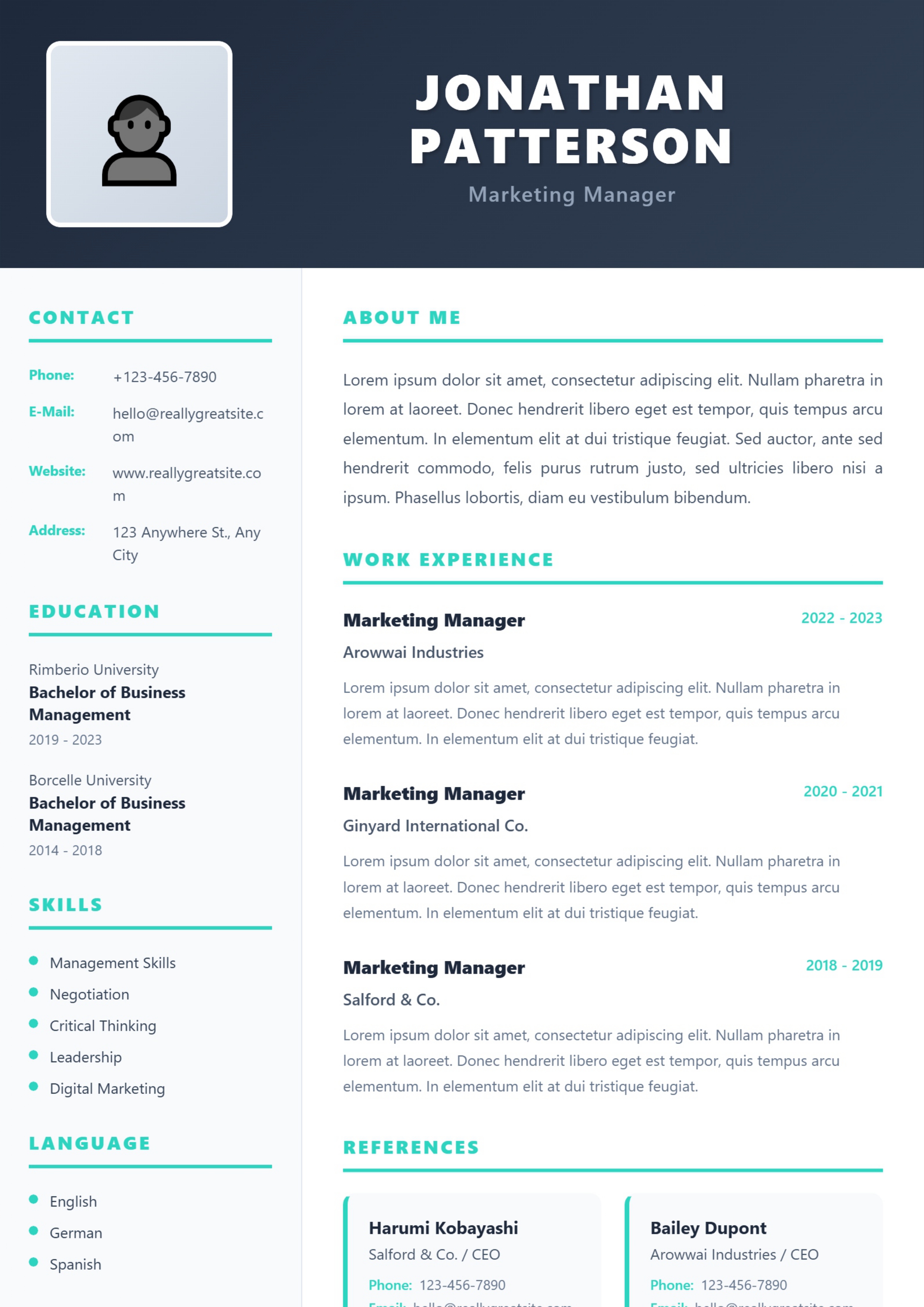
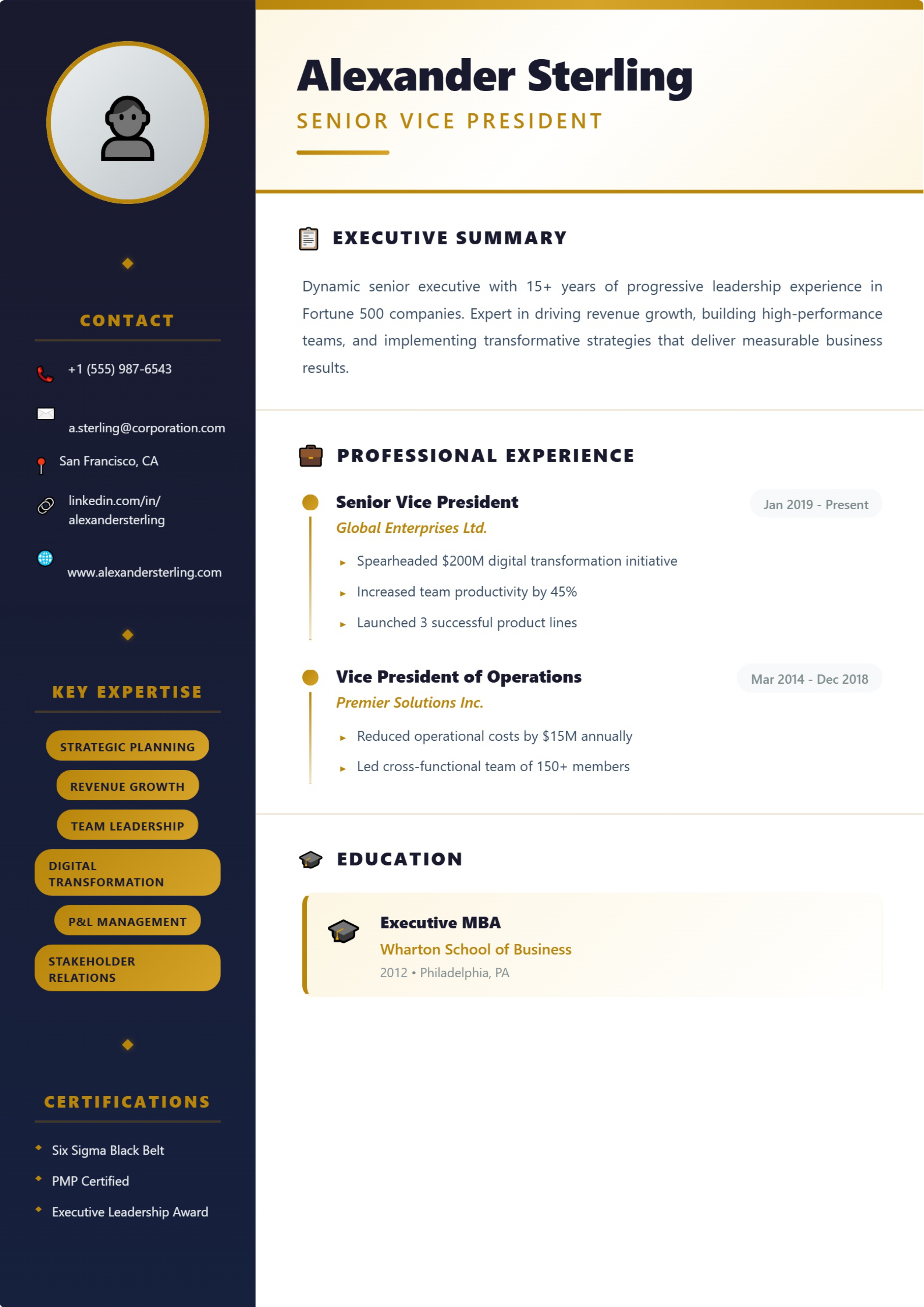
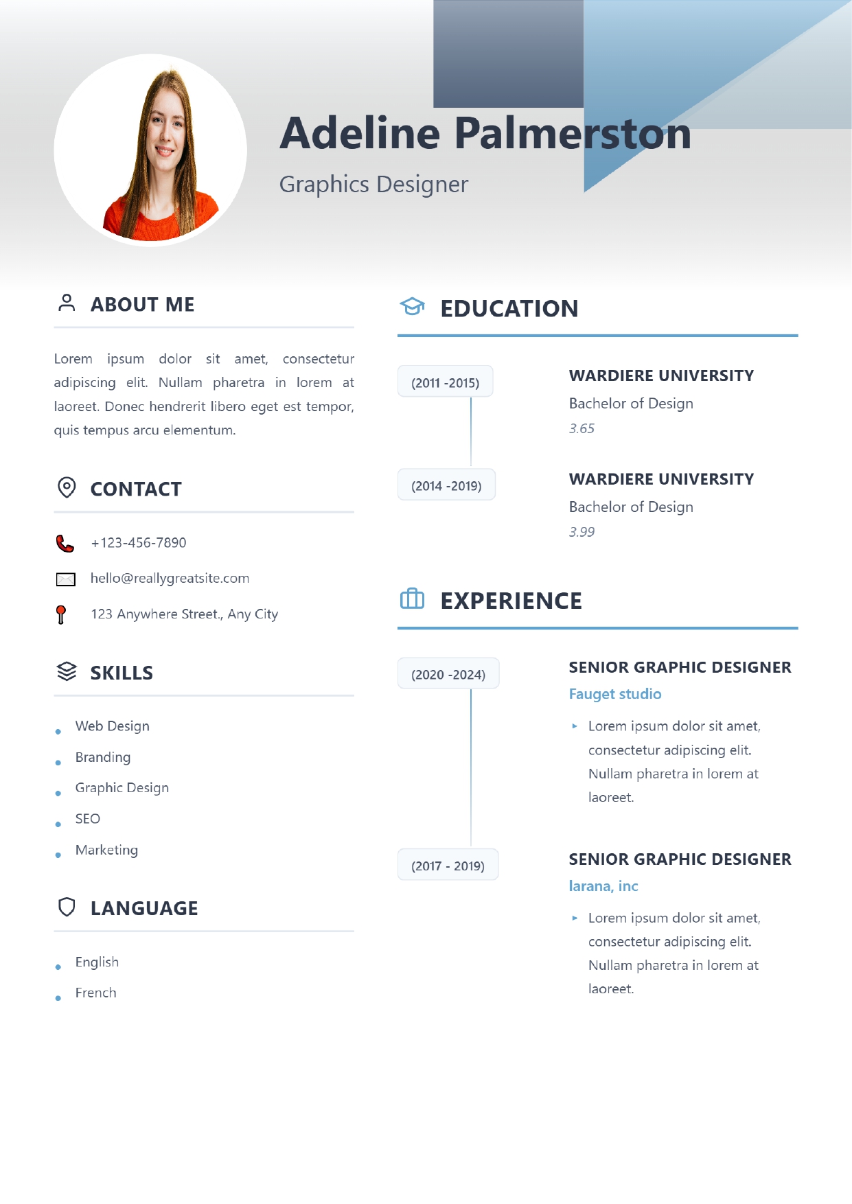
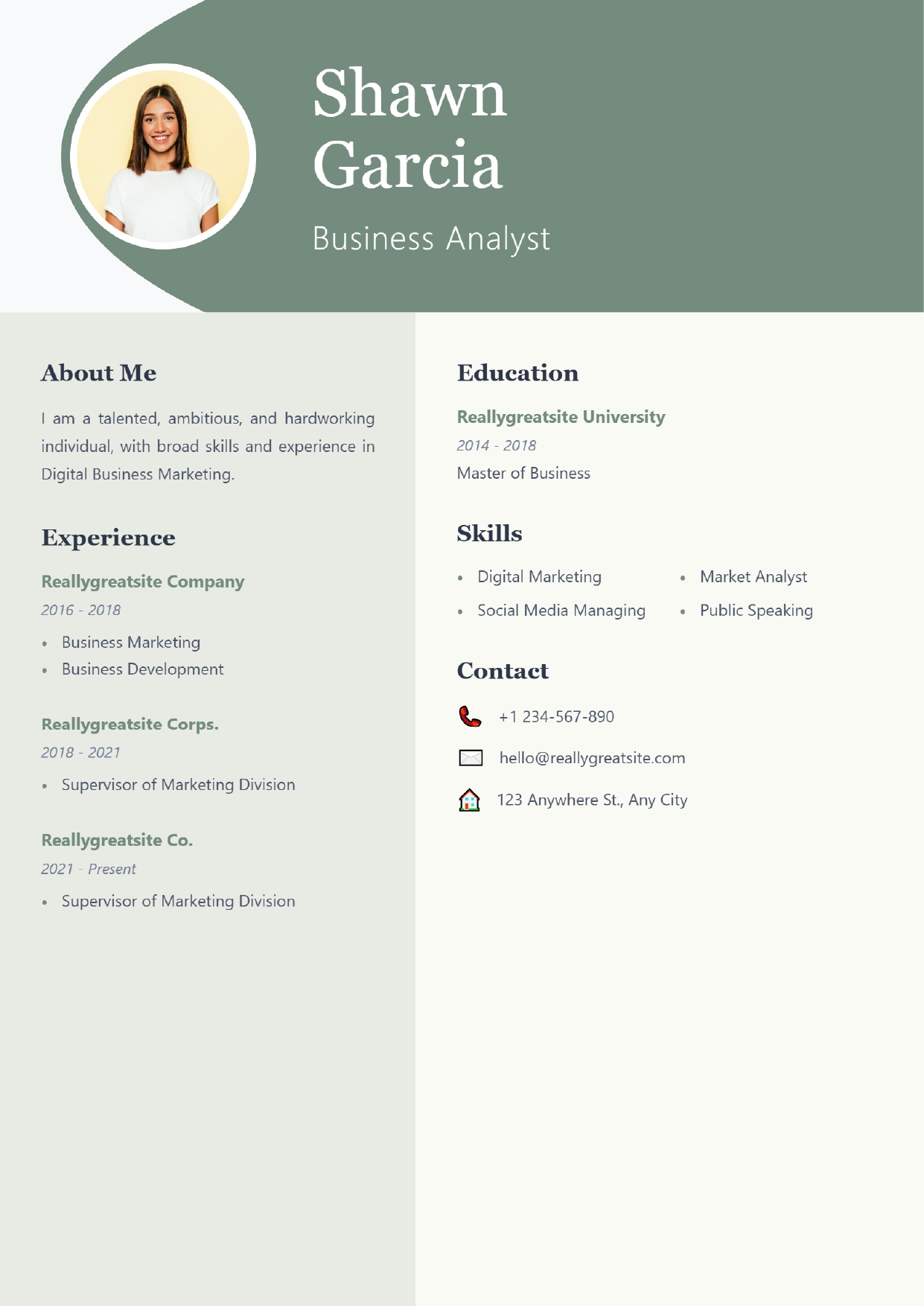
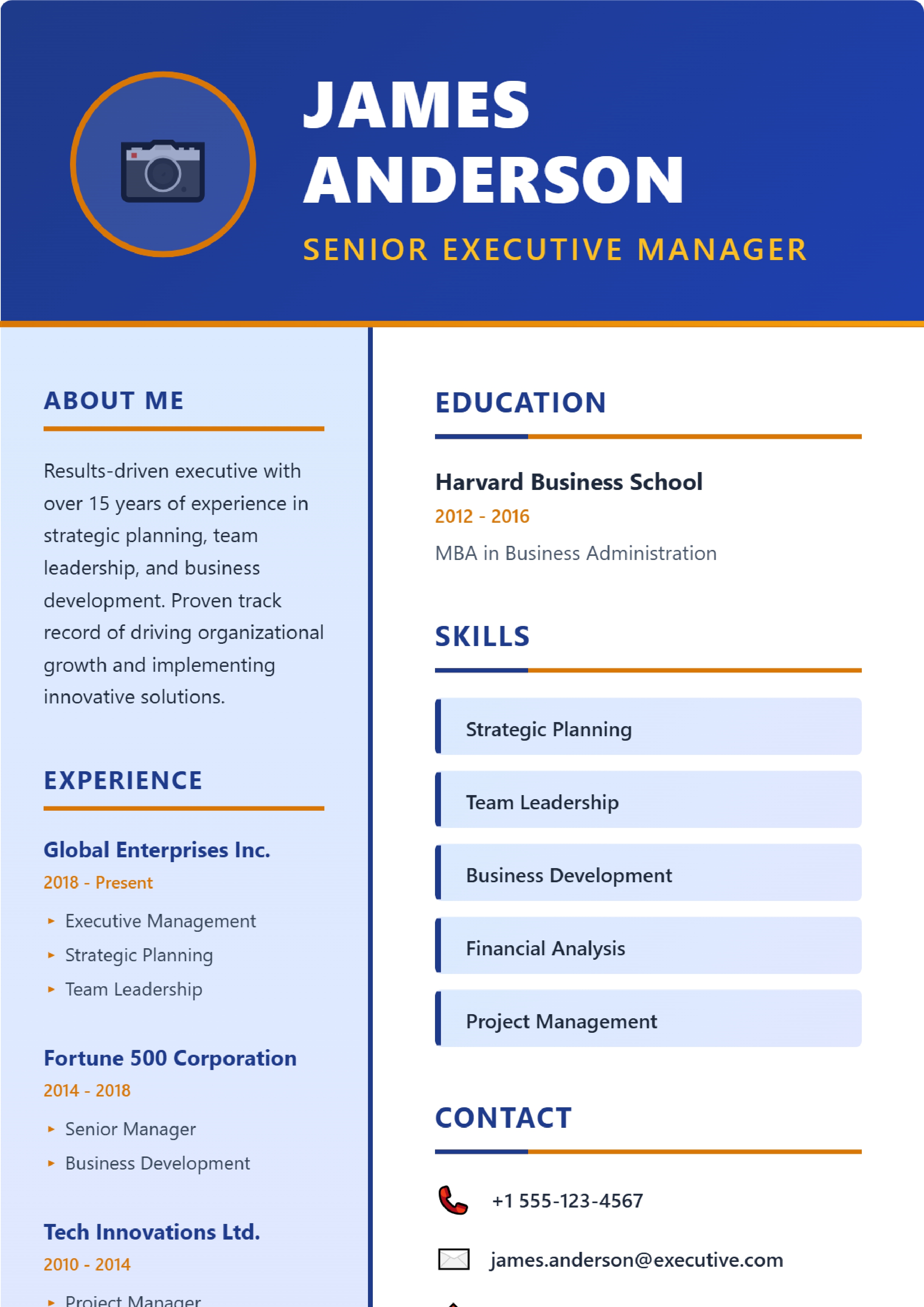
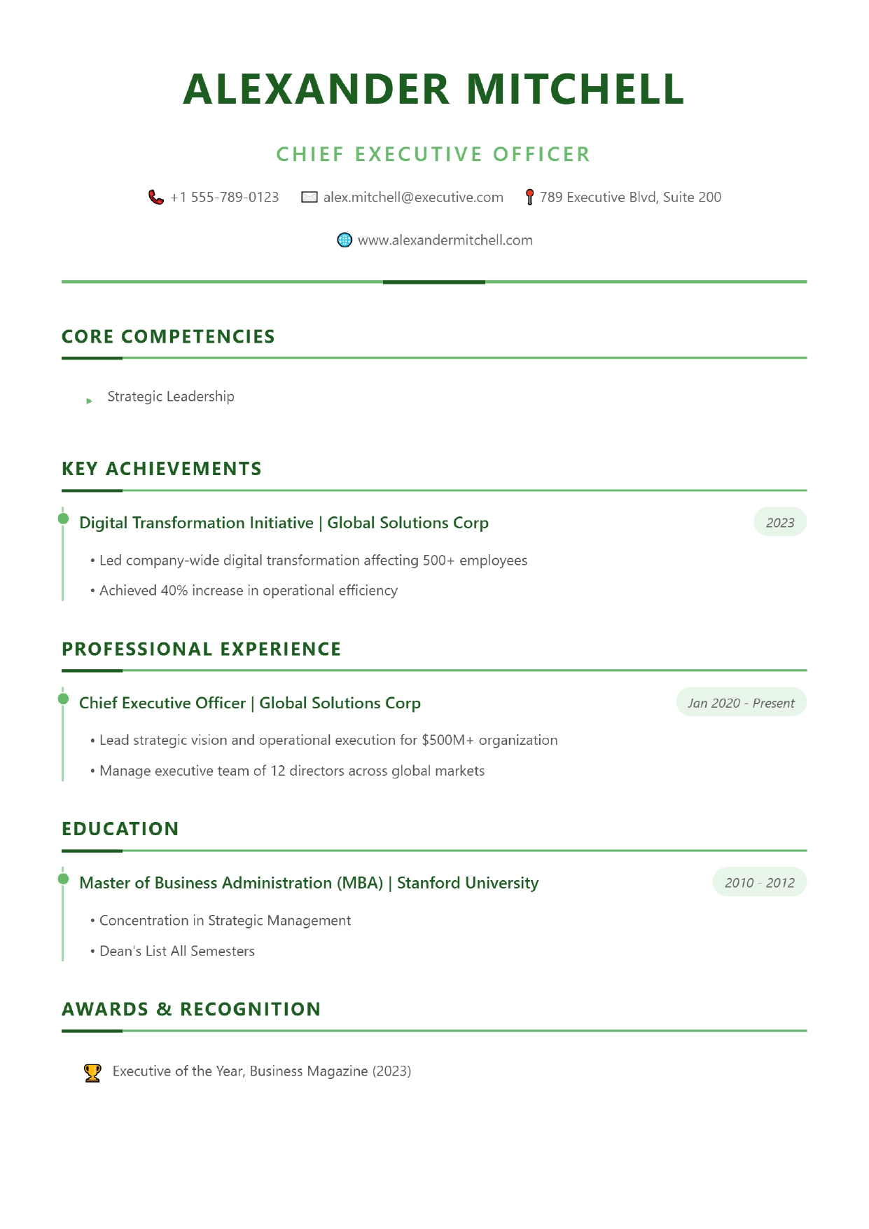
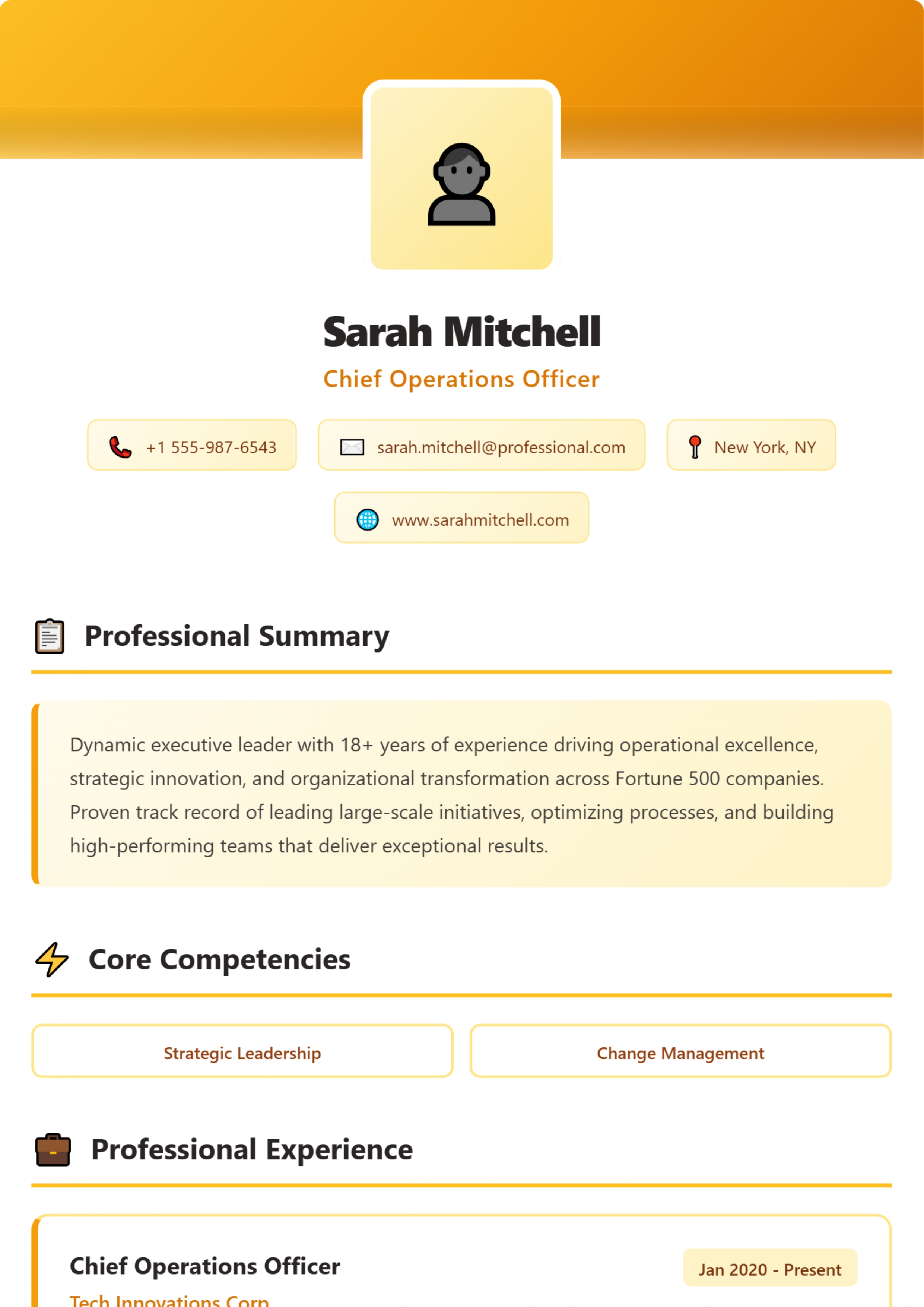
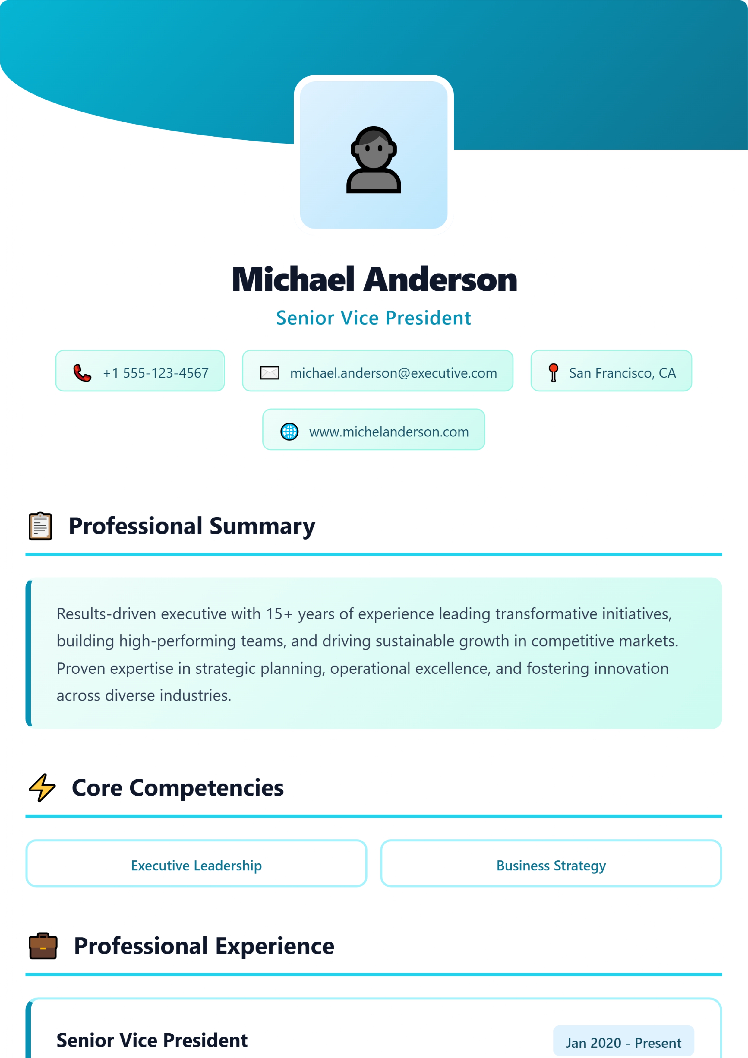
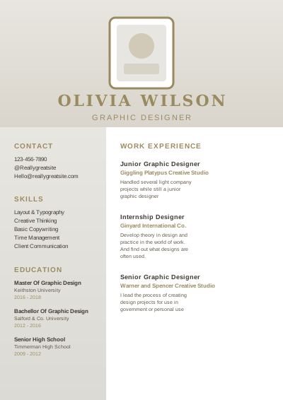
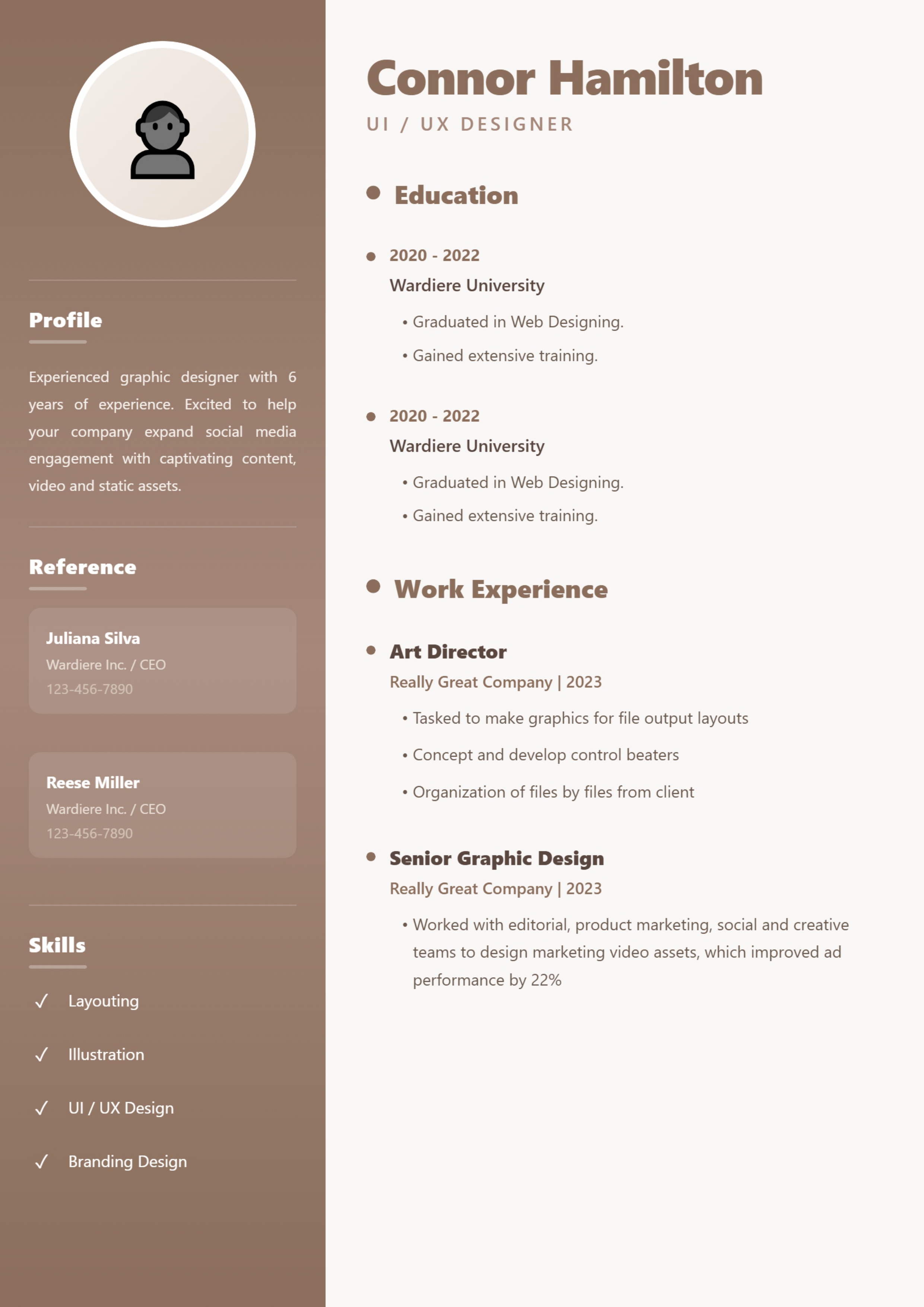
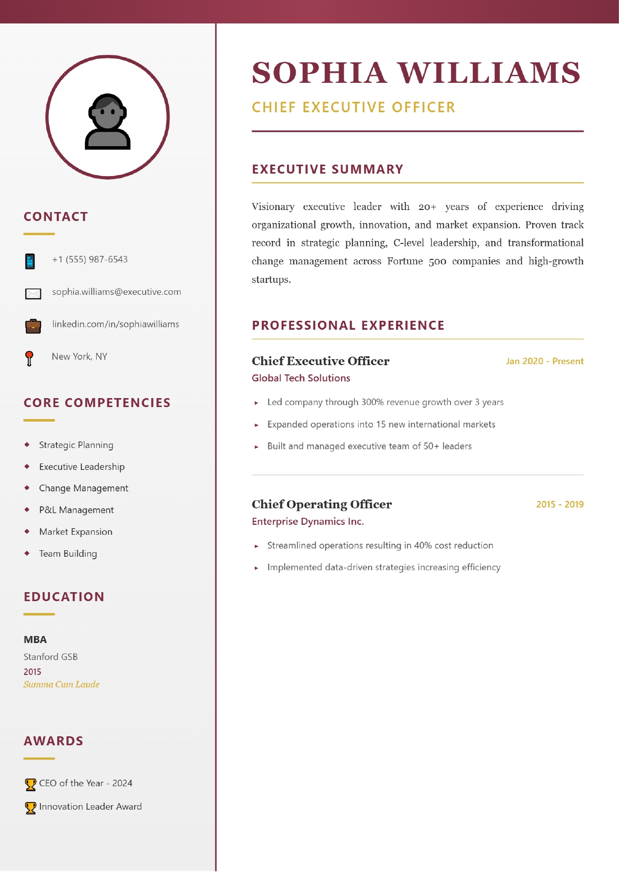
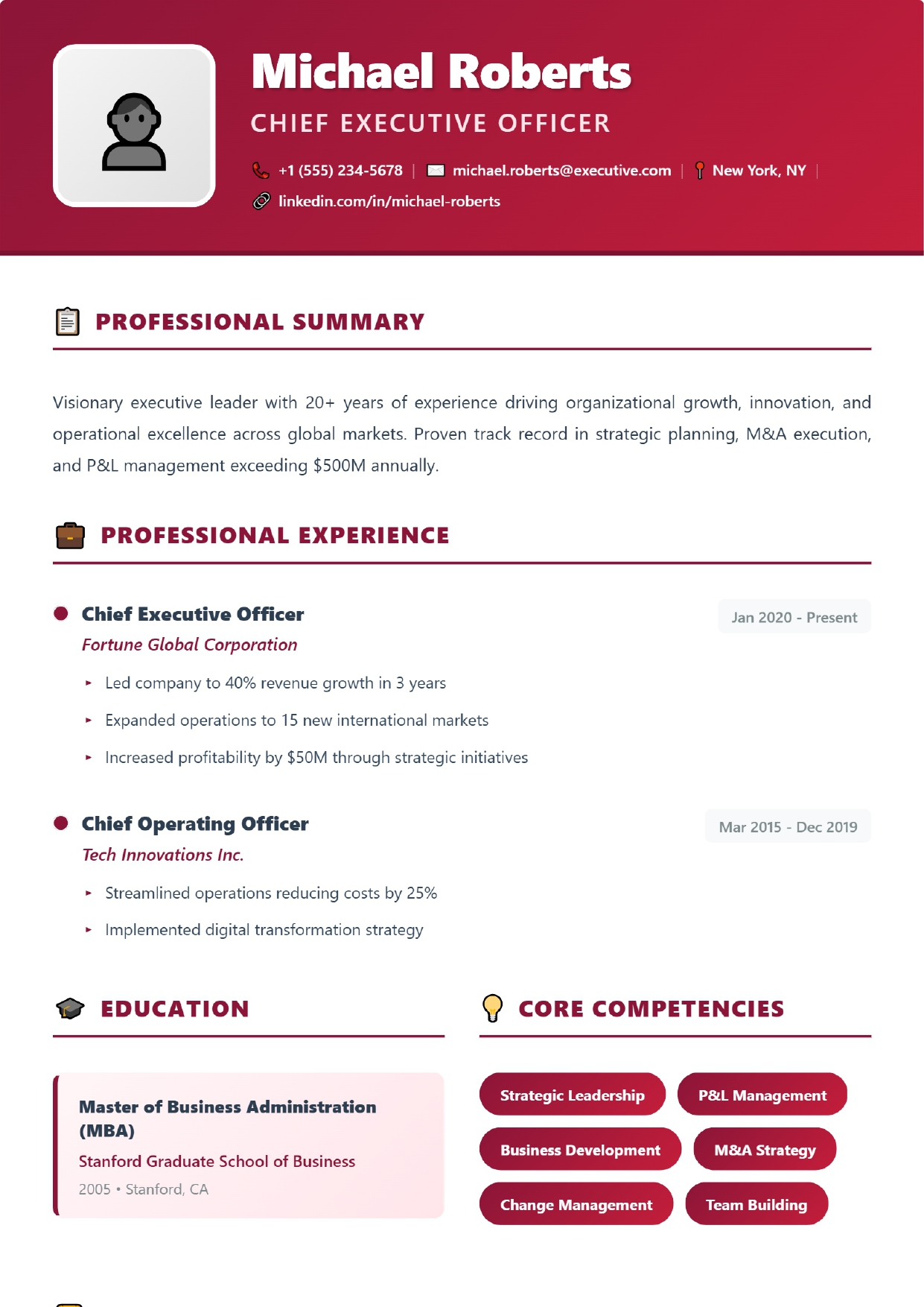
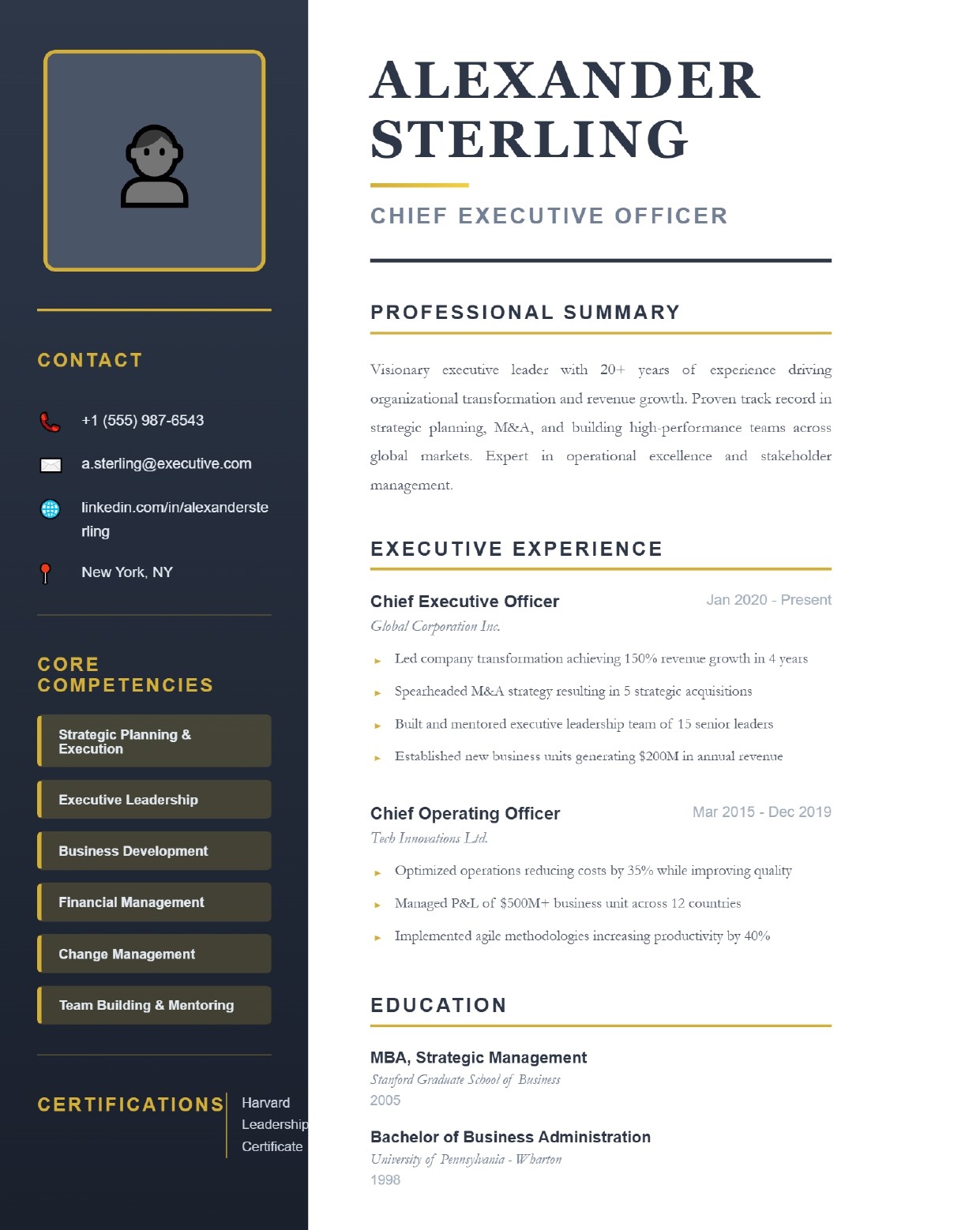
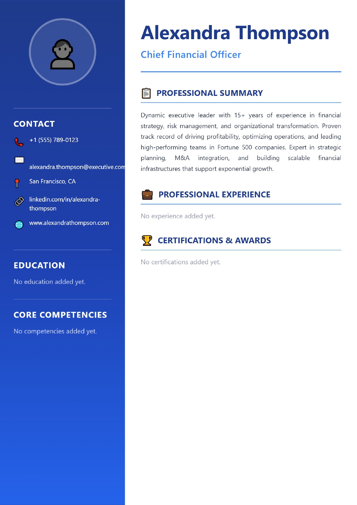
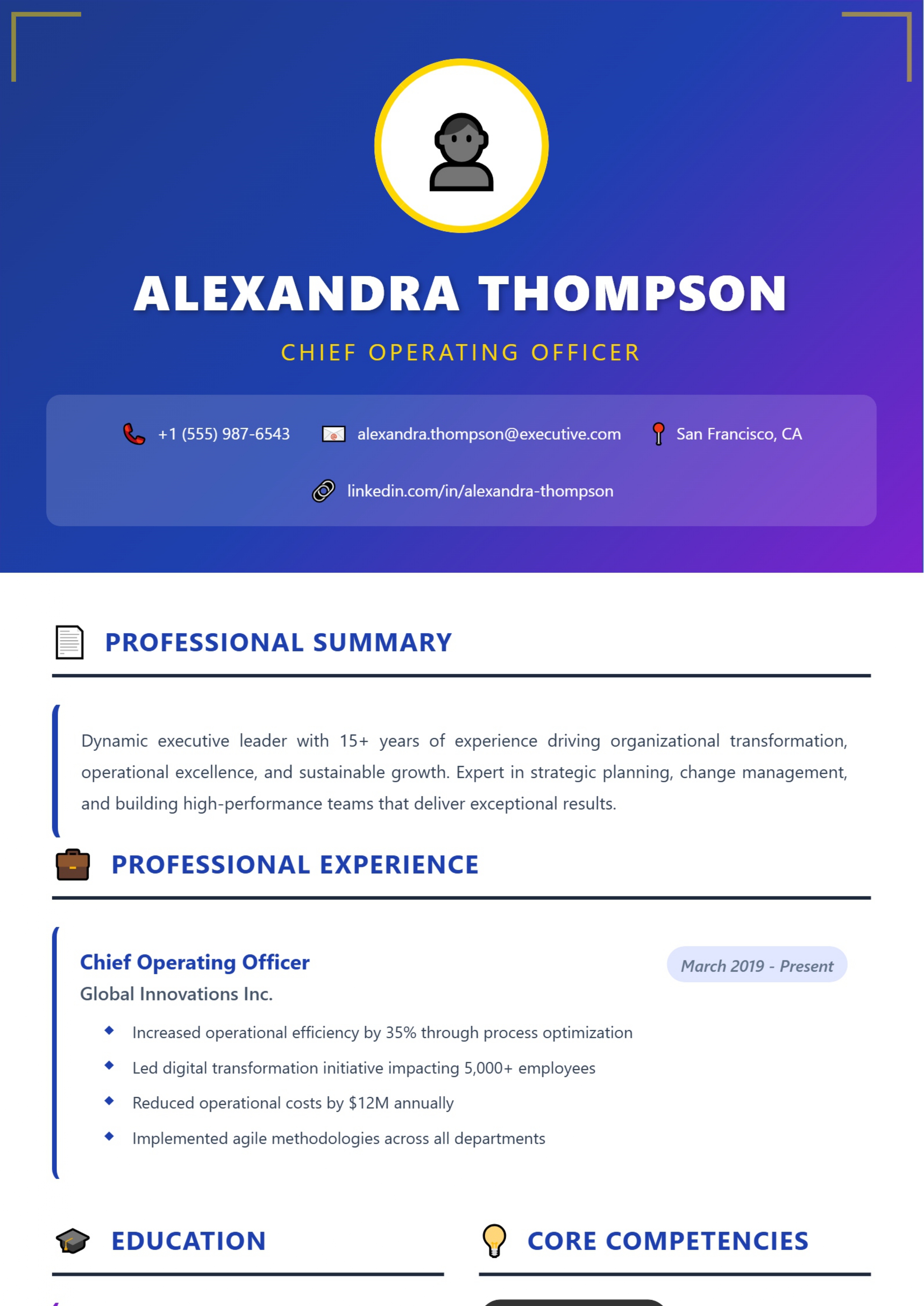
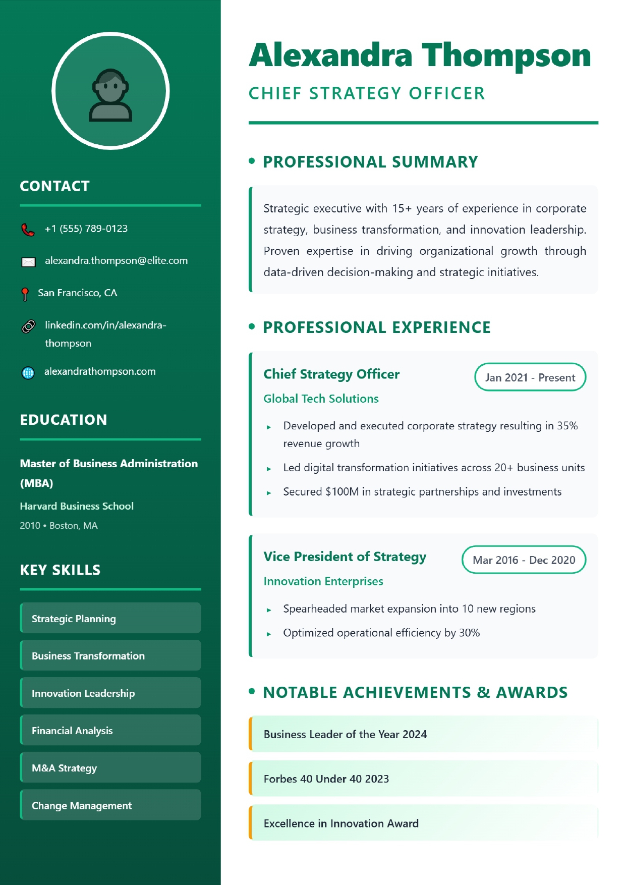
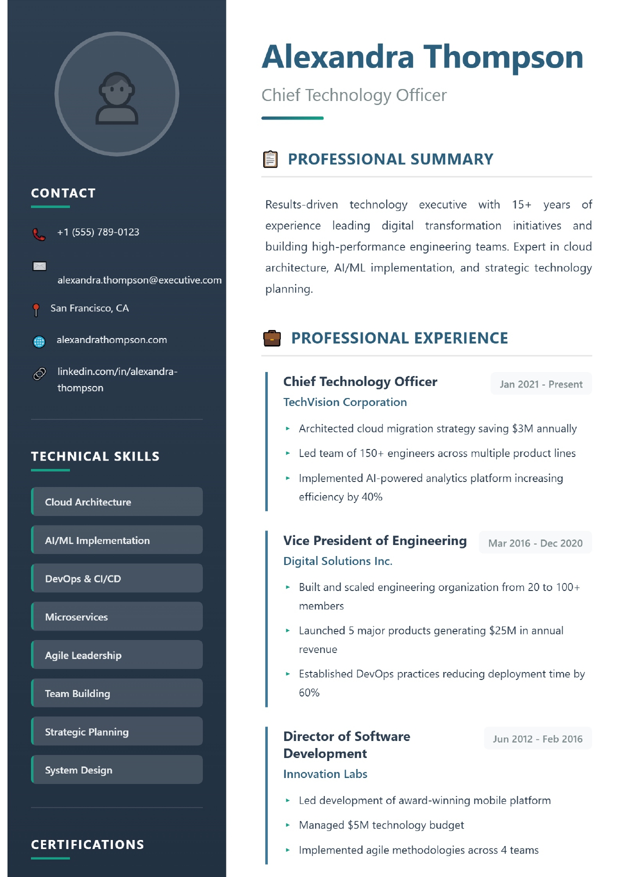
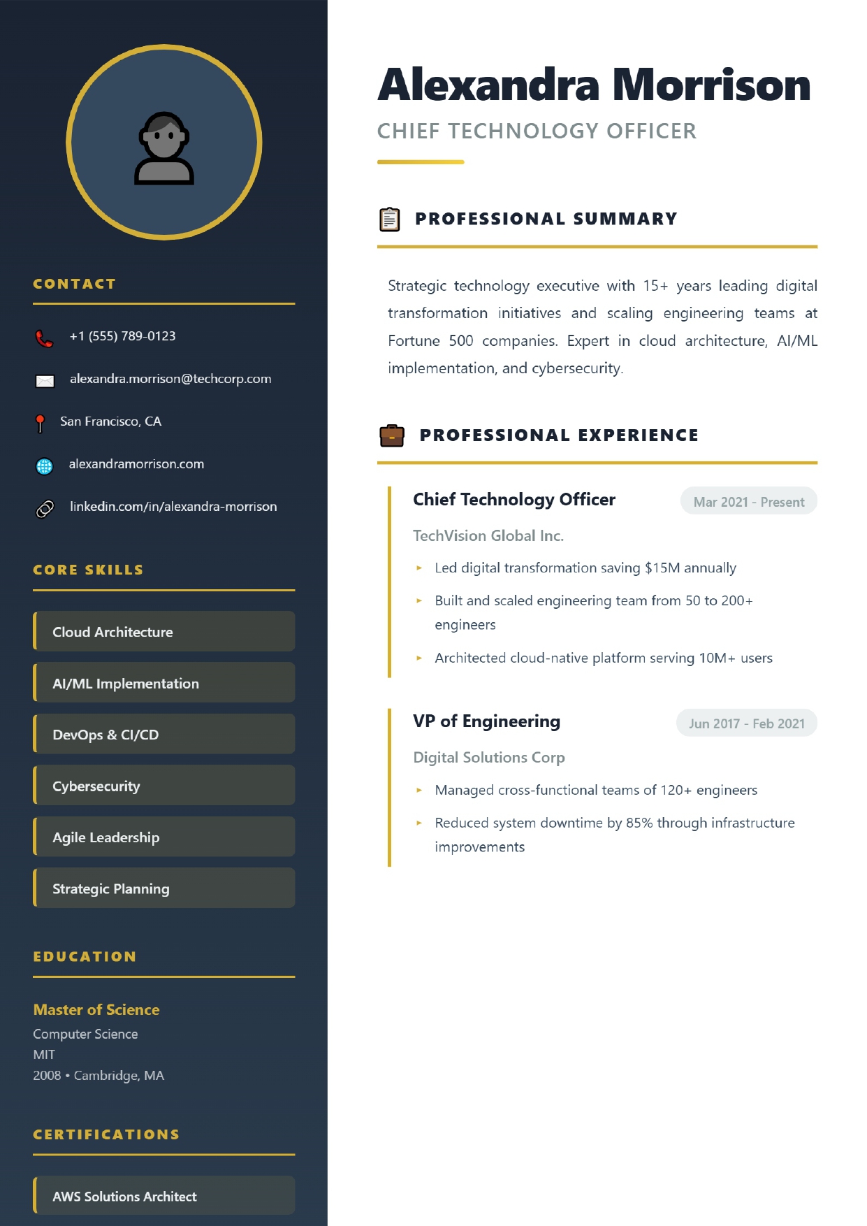
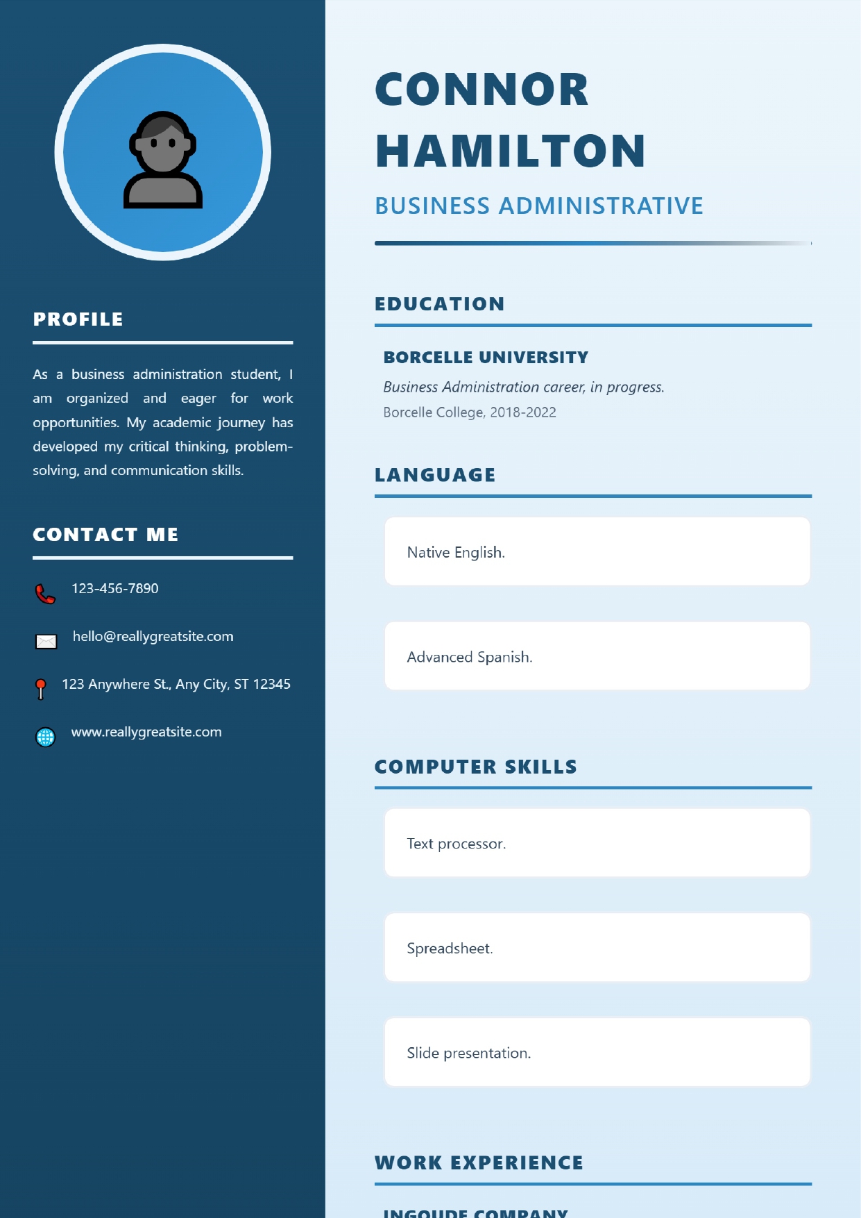
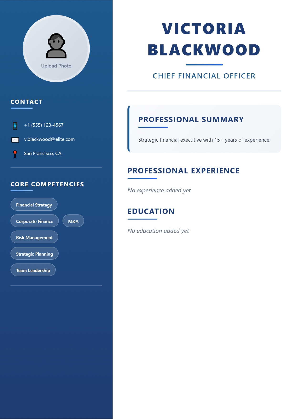
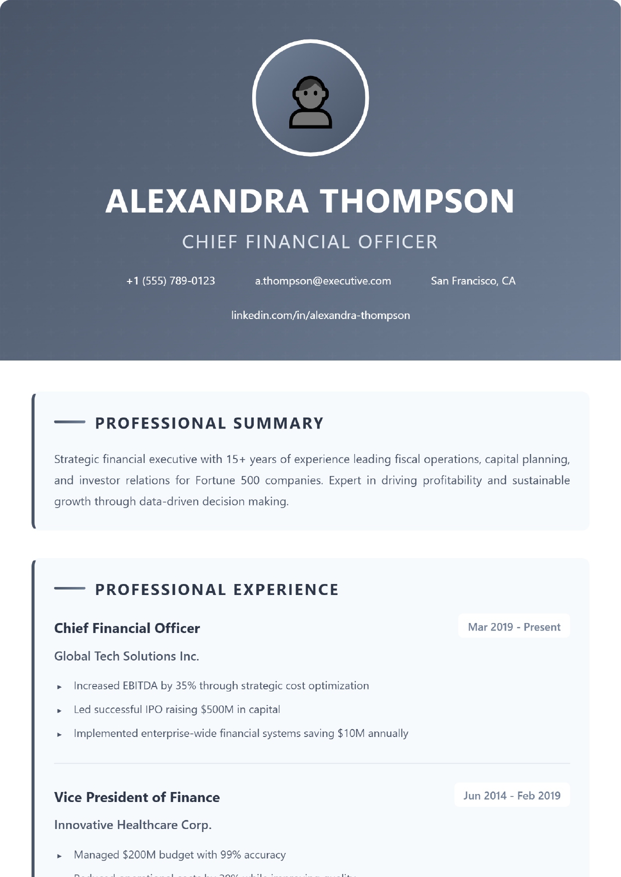
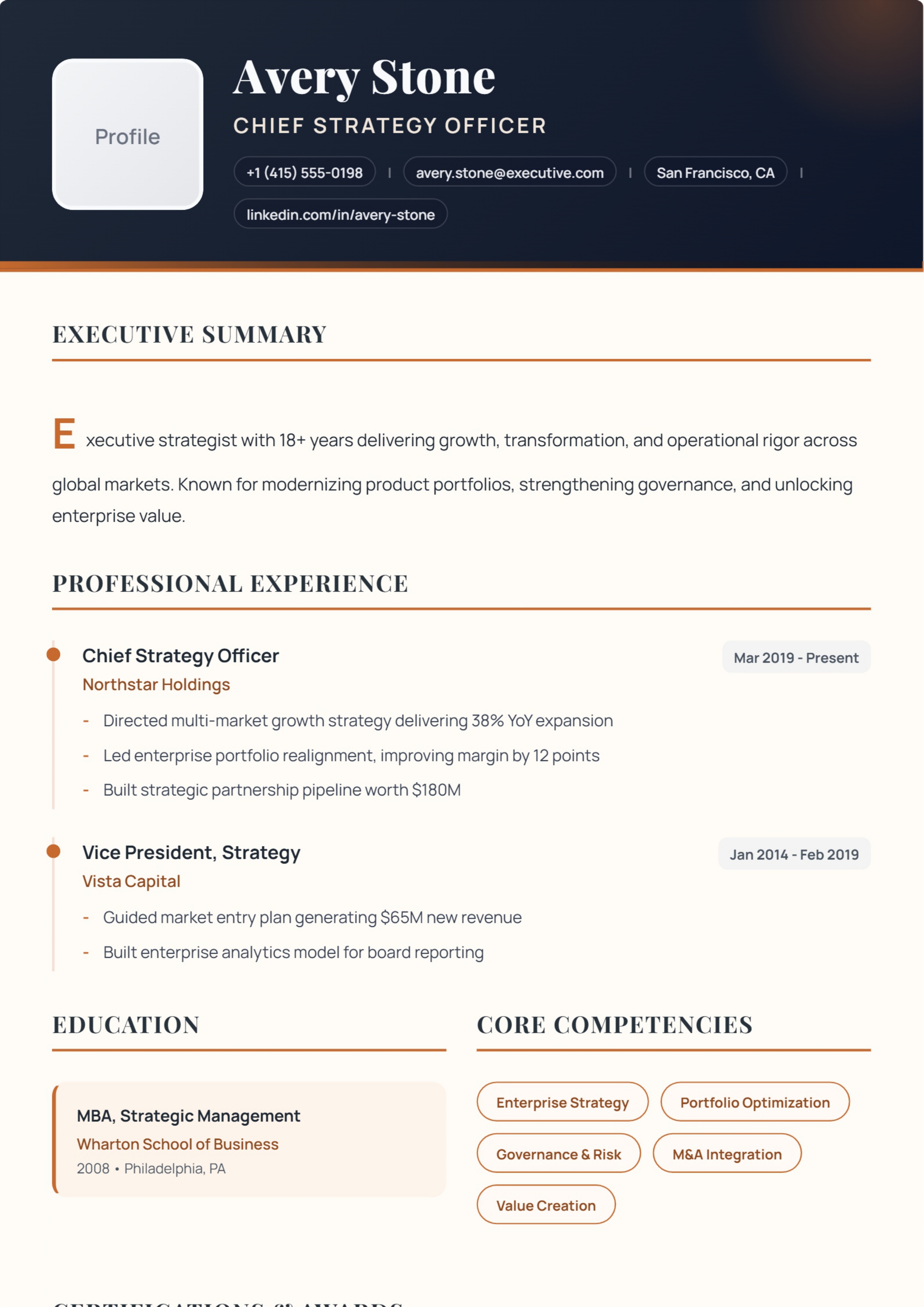
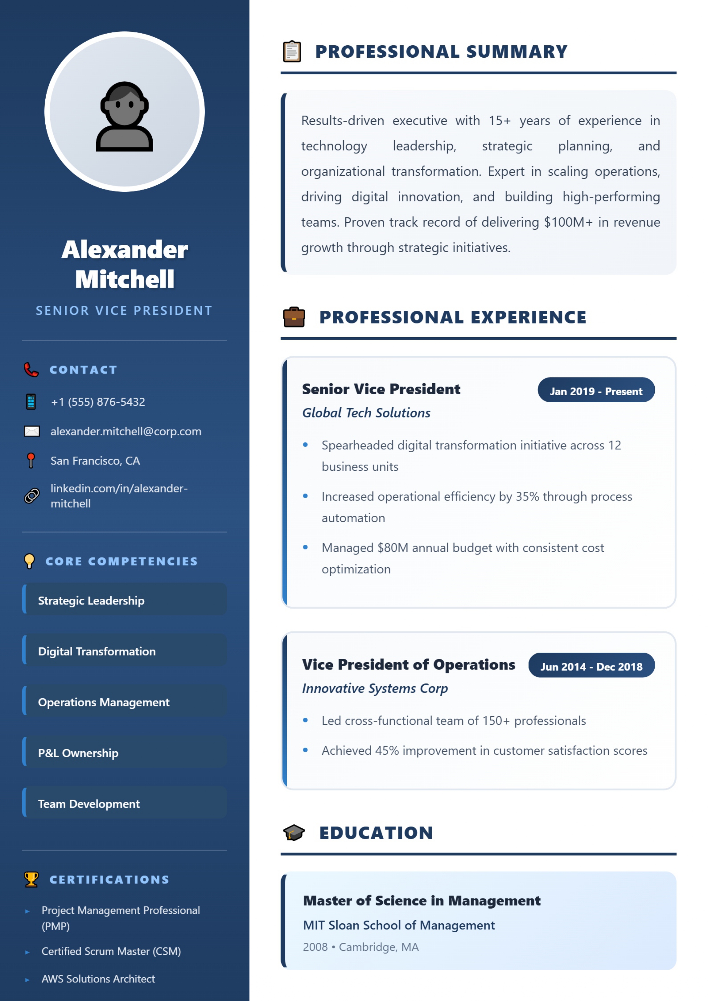
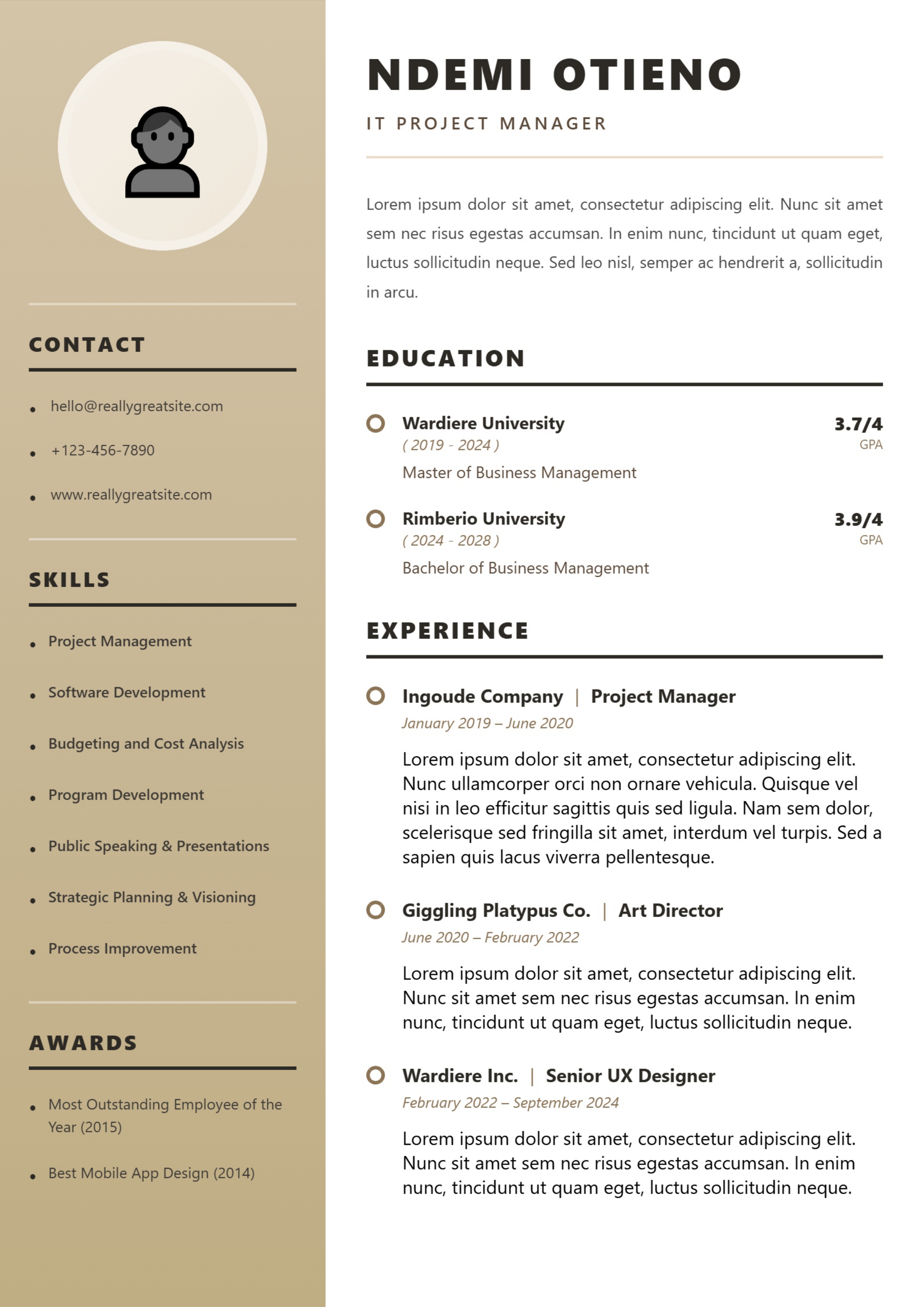
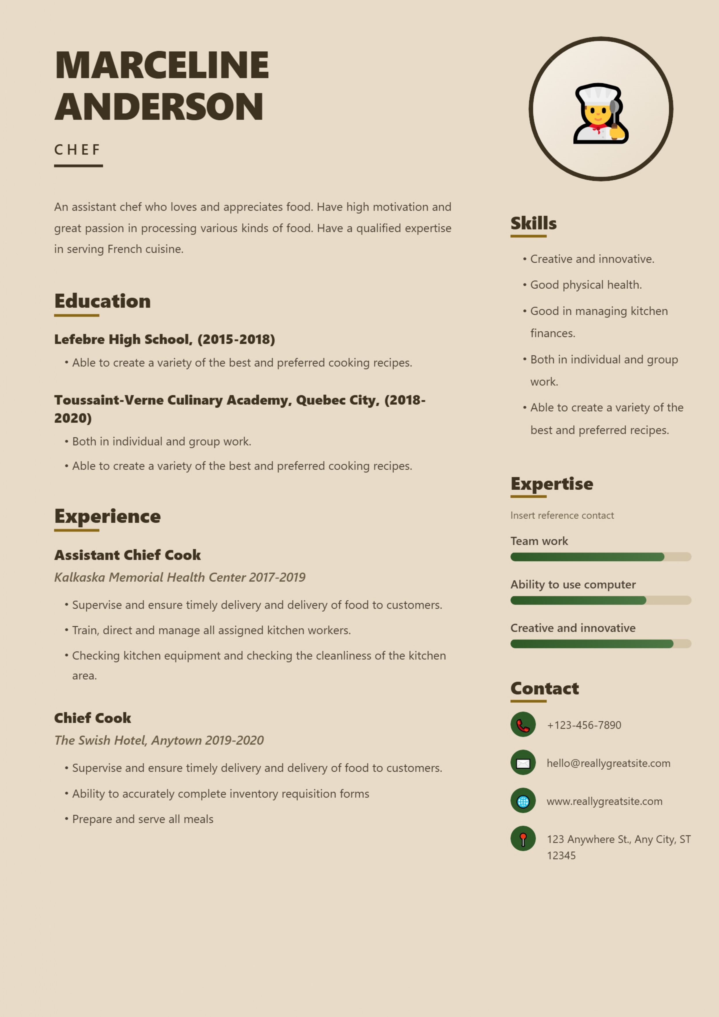
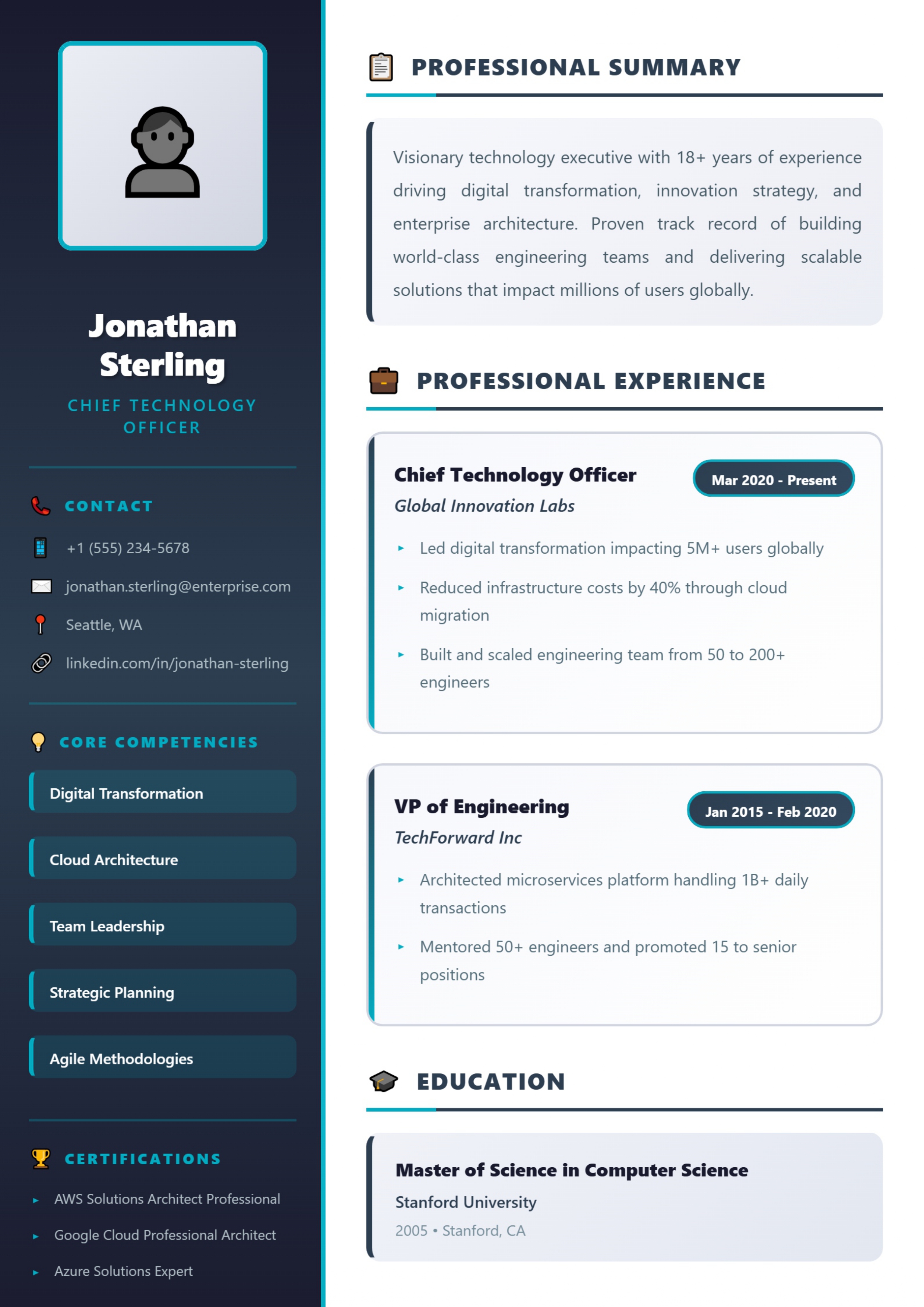
40 layouts, from plain single-column to executive designs with a sidebar and photo. Open any template to see who it suits, its weak points, and what you can do with it on each plan.
What is free: the two Simple templates can be filled in and downloaded at no cost (guests are asked for an email address first). Every other template can be opened, filled in and previewed for free; downloading it needs Pro (₹99 for 30 days) or Premium (₹199 for 30 days), both one-time payments. Downloads are image-based PDFs, and the builder does not save your entries — details in the FAQ.
How to choose a resume template
A layout cannot make weak content strong, but it decides how easily a reader finds the strong parts. Three questions settle most choices:
- How will you send it? If you are uploading to a company's job portal, the portal may try to read the text in your file. A single-column layout is the most predictable for that — and because downloads from this builder are image-based PDFs, also keep a text-based copy for those portals. If you are emailing a named person or handing over a printout, any layout works.
- How much history do you have? Sidebars and three-column layouts look balanced with two or three roles and cramped with eight. Long careers fit single-column and header-with-single-column layouts best.
- Does your field expect restraint? Law, audit, banking and most public-sector employers favour plain pages; creative and marketing roles allow more colour.
The five layout types in this library
| Layout | Good for | Watch out for | Examples |
|---|---|---|---|
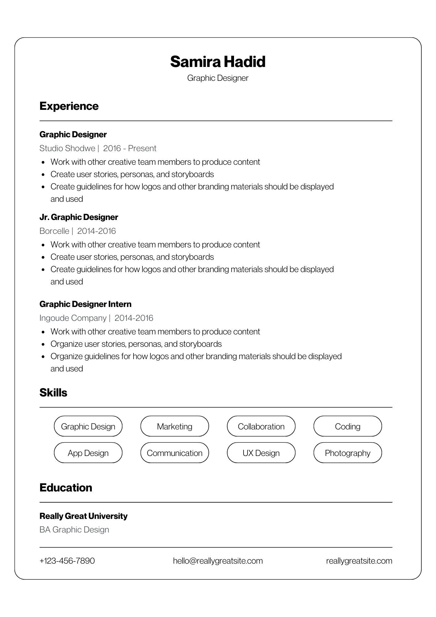
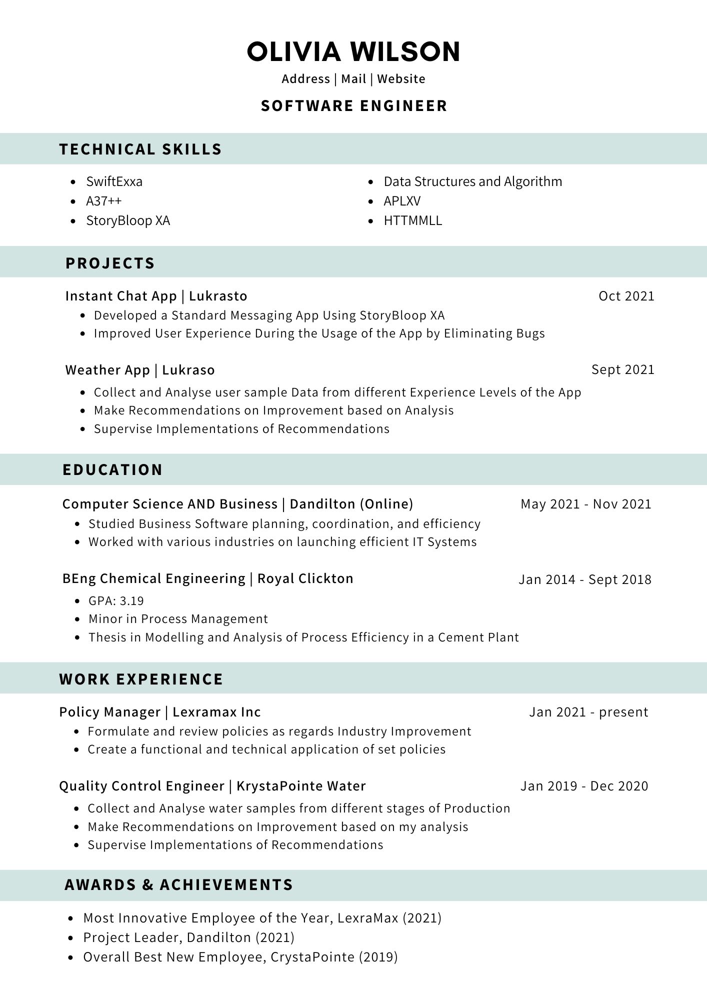
| Single column | Portal applications, freshers, conservative fields, long histories | Plain look — content has to carry it | Clean Professional (free), Modern Bordered (free), Emerald Executive |
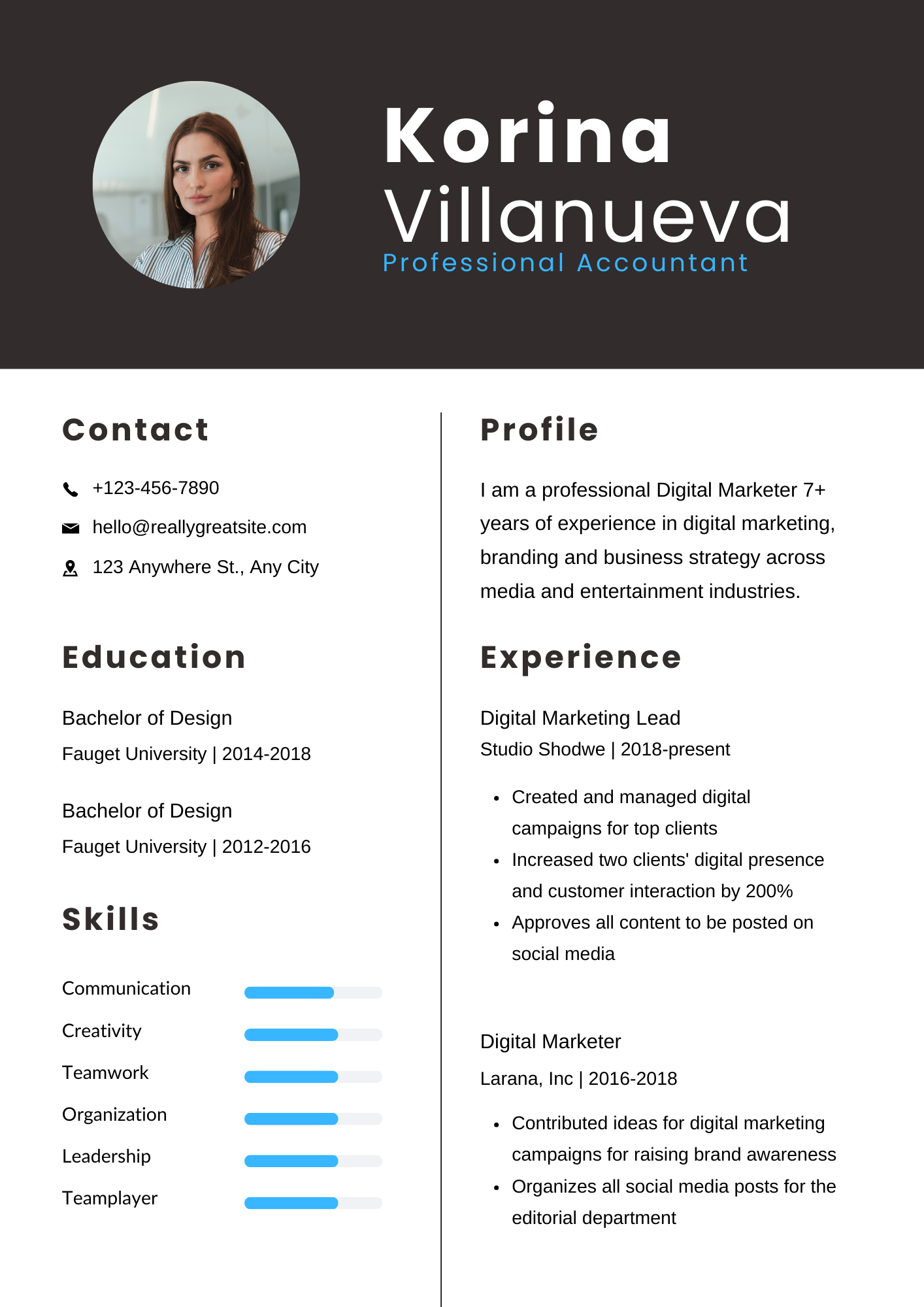
| Header + single column | A visual top with a simple reading order | Header takes a share of page one | Titanium Executive, Ocean Professional |
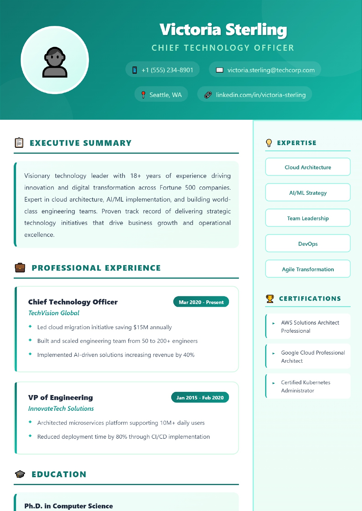
| Header + two columns | Skills or certifications kept beside experience | Narrow column wraps long text | Azure Corporate, Emerald Gradient |
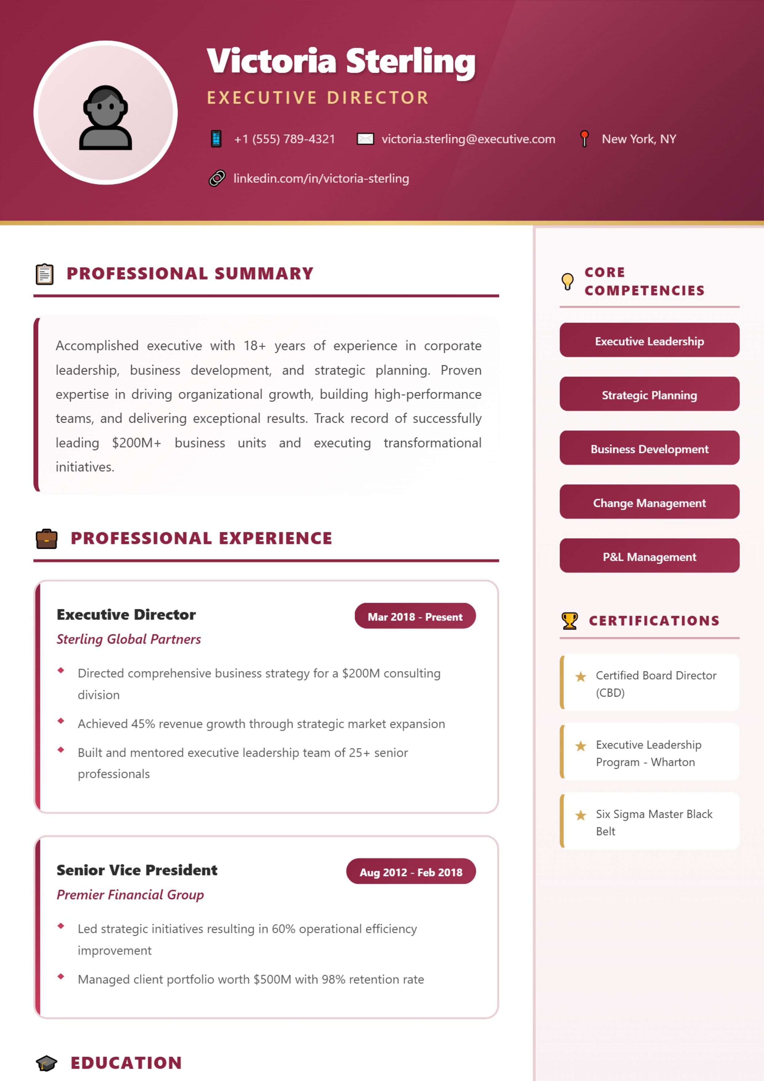
| Header + three columns | Dense one-page summaries for direct email or networking | Very short lines; least suited to portals | Navy Elite, Crimson Executive |
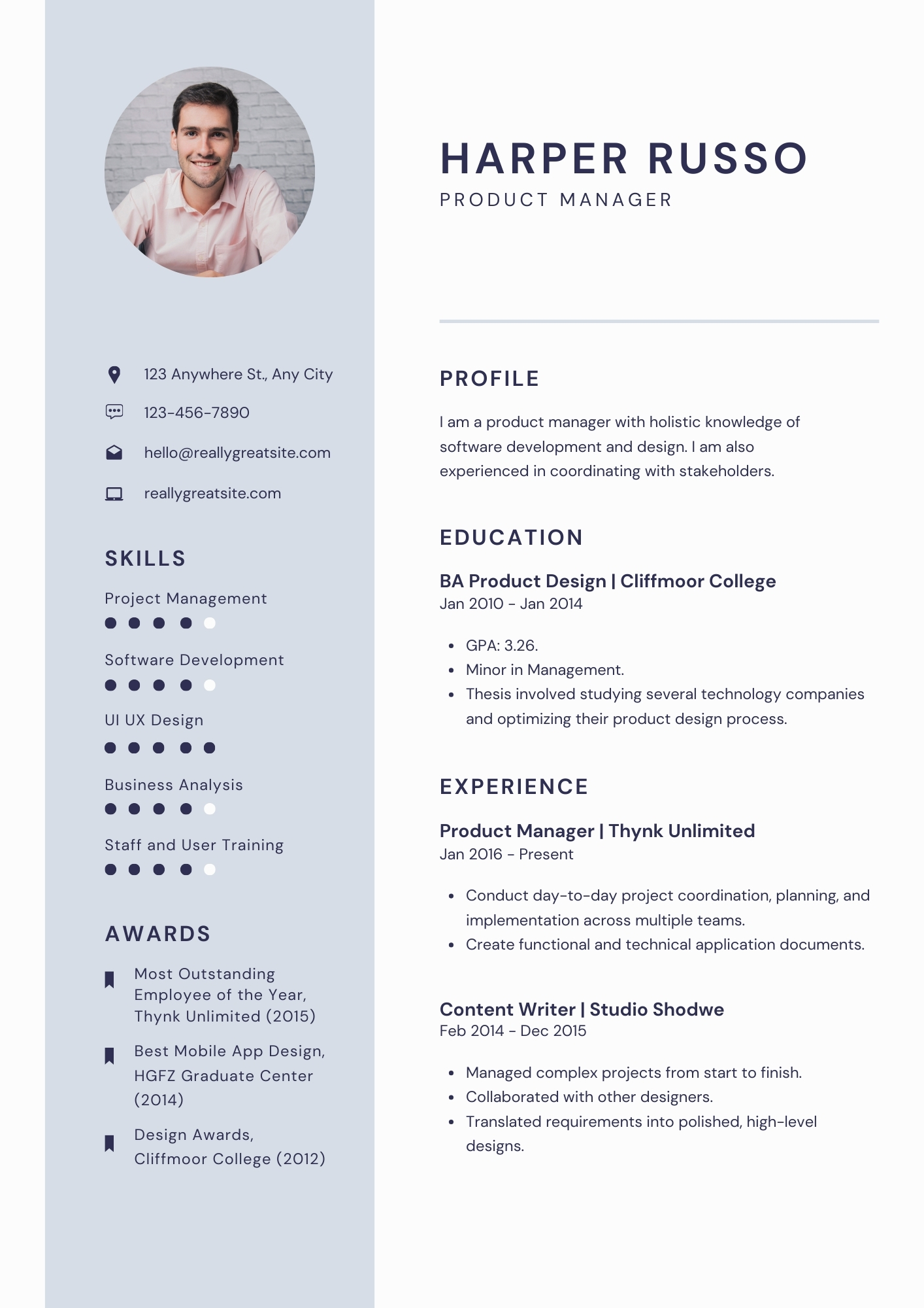
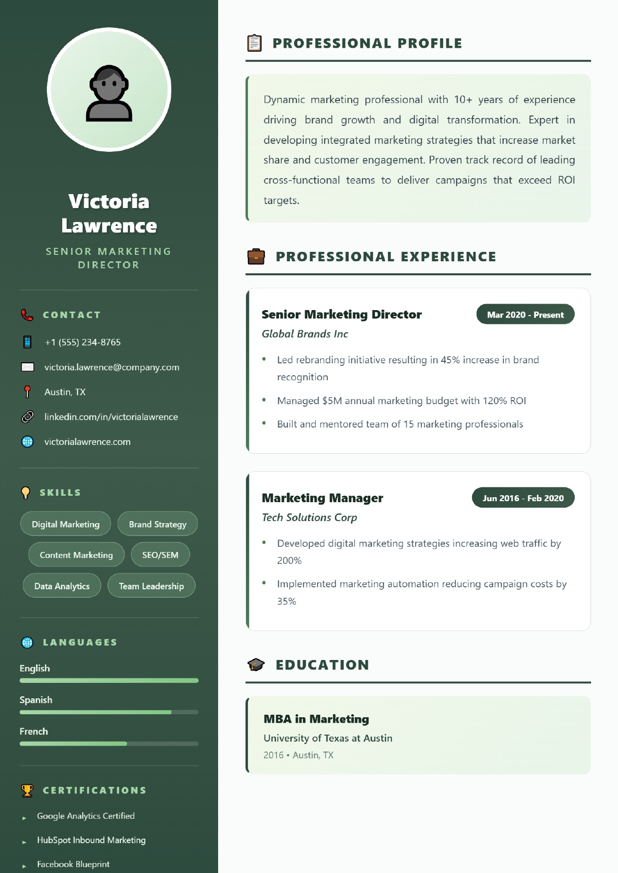
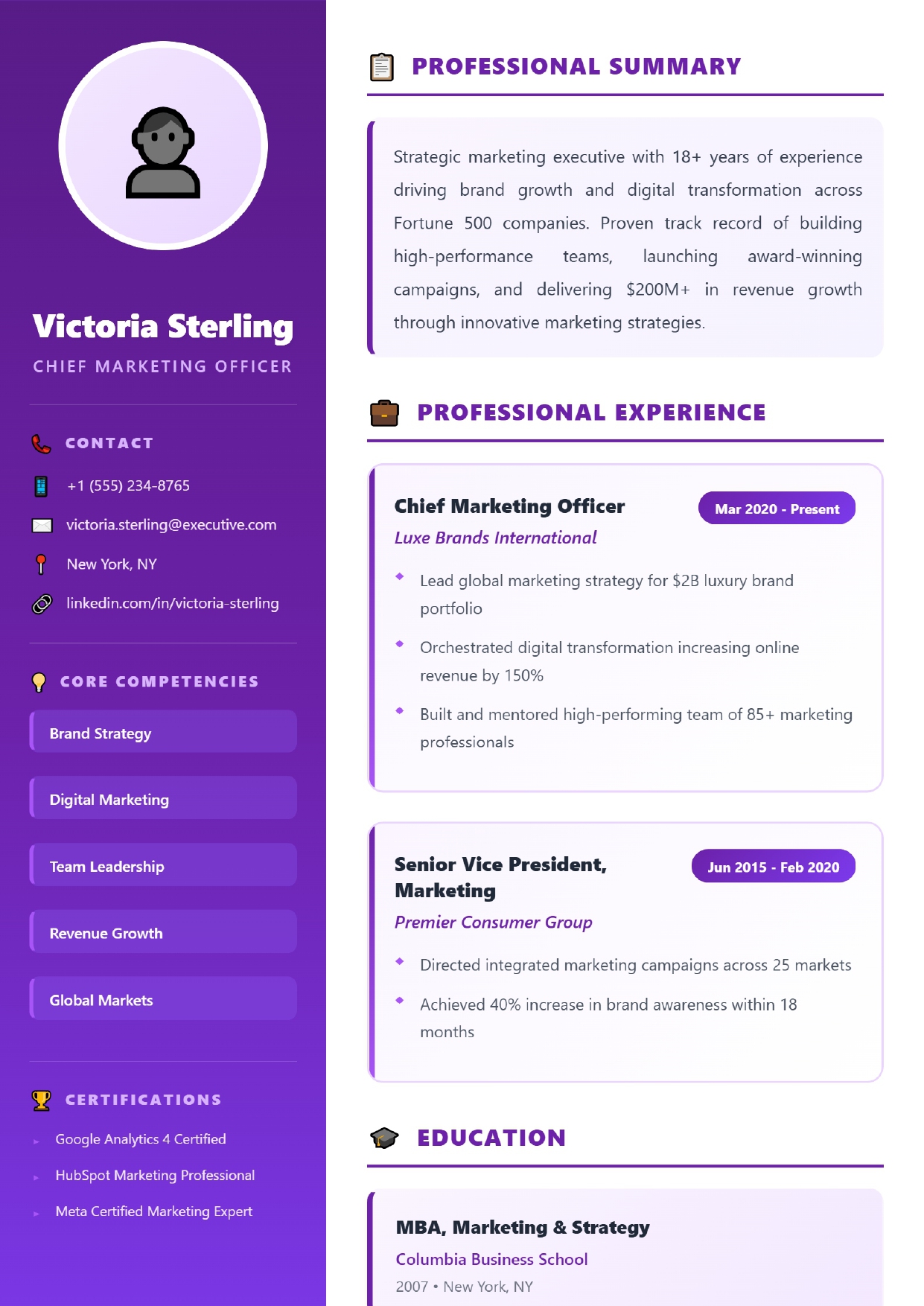
| Left sidebar | Organised pages with contact and skills set apart | Narrow sidebar; two columns are less predictable for software | Teal Modern, Cobalt Executive |
Photos and skill ratings
Most templates in the Professional, Modern and Executive categories include a photo area. For most jobs in India, the US, the UK, Canada and Australia a photo is not expected; you can leave the area empty, but a template designed without one (the two free templates, or Emerald Executive) usually looks better in that case.
A few templates show skills as rating bars or dots. A self-rating tells a reader little — four out of five compared with whom? Where you can, name what you did with the skill instead. Each template's detail page says which style it uses.
Mistakes worth avoiding
- Choosing on looks alone. The most striking thumbnail is rarely the best fit for nine roles and a two-page history.
- Shrinking type to force one page. Cut content instead; a second page is fine when the experience justifies it — see when two pages make sense.
- Filling every inch. White space is what makes a page scannable.
- Using one version for every job. Keep your master text in your own document and adjust it per application — the builder does not store it for you. Our guide to tailoring a resume shows how.
Not sure where to start?
Try the free Clean Professional template. It suits most first resumes and portal applications.
See Clean Professional Formatting guideWriting a Statement of Purpose instead? Start with our SOP guide, then use the SOP builder.